Less dashboard furniture.
More patient context.
A working moodboard for how information is organized, compared and reviewed. Keep the MARMAR brand. Make the evidence easier to read.
The palette stays.
White surfaces, gray structure, dark text and restrained MARMAR green. Amber communicates unresolved review; it is not decoration.
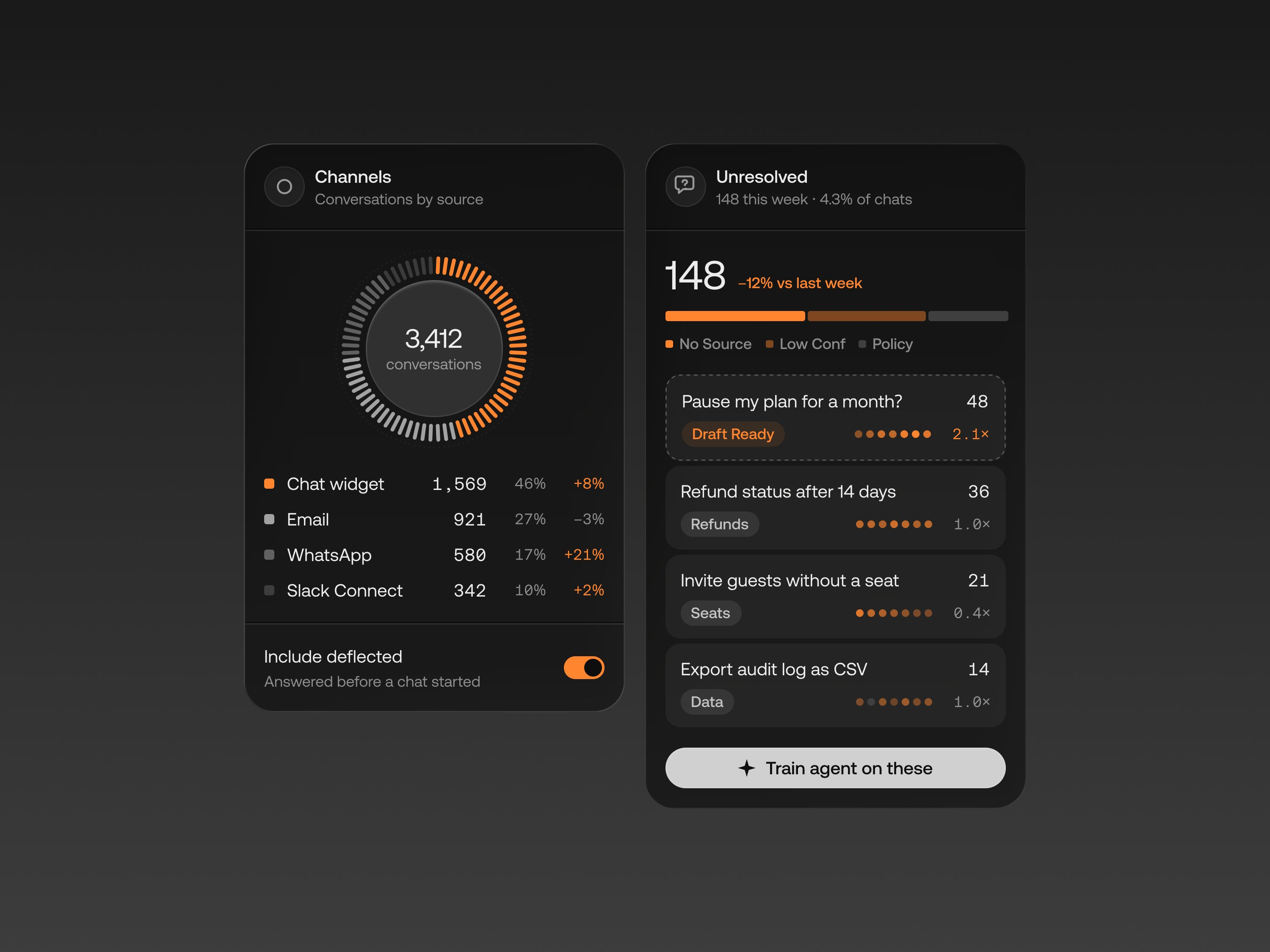
Give related data a shared home.
Borrow the clear section headers, aligned values and status labels. For MARMAR: medication, lab, history and identity groups with source links attached to every fact.
AI Support Agent Dashboard UI · Yuri Gokoryan · Collect UI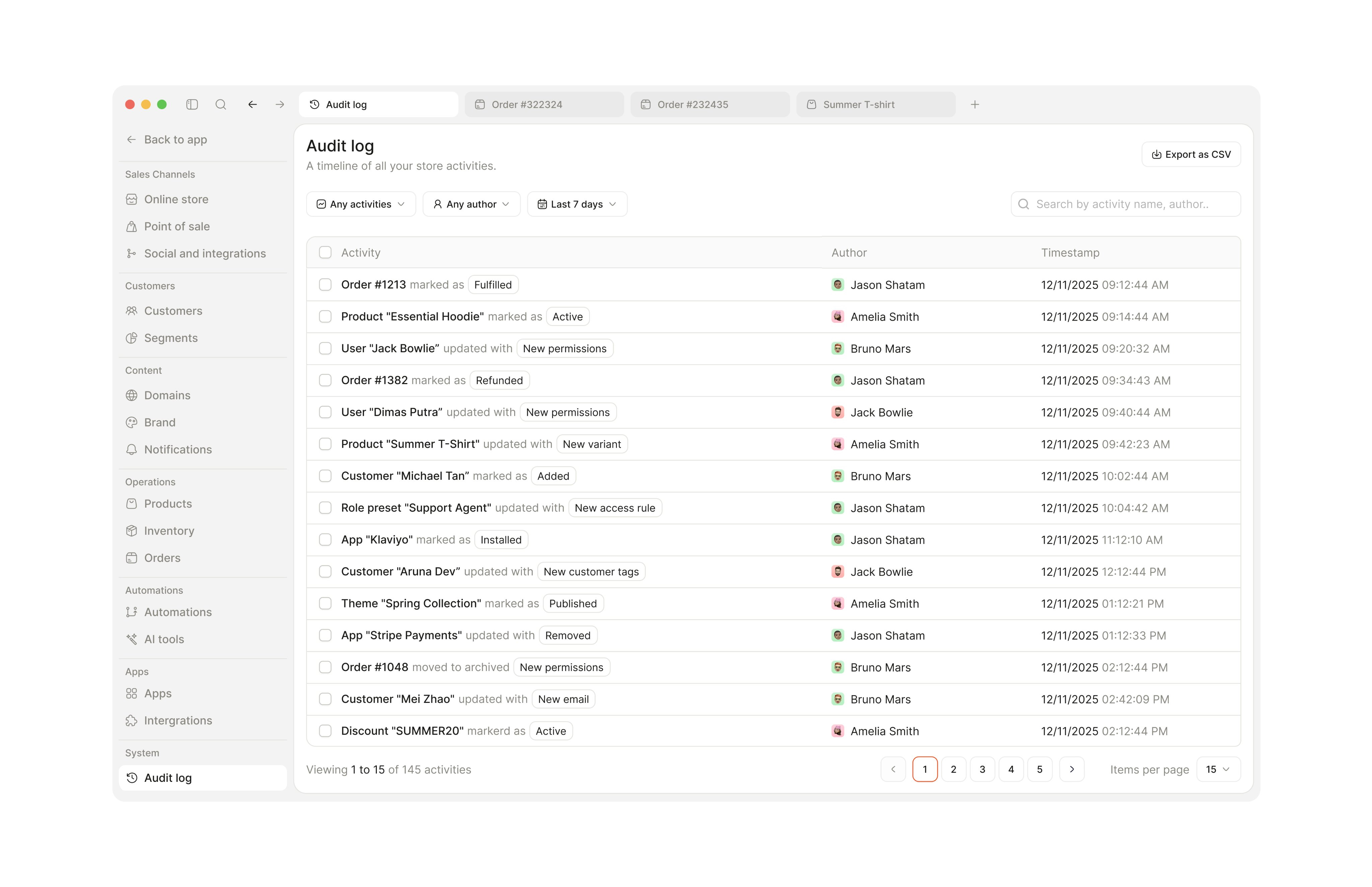
Make every row predictable.
Consistent row rhythm, quiet dividers and compact filters help people compare information. For MARMAR: fact and dose on the left, a labelled review decision on the right.
Full view · Collect UI table collectionThe review is the main event.
Keep original records alongside extracted facts. Hide optional workspace utilities behind a disclosure. Replace oversized counters with one compact progress strip.
Explain what changed.
Two clearly labelled result columns distinguish the medication-only check from the check with reviewed context. Show actual rule counts, then the findings and evidence underneath.
Illustrative synthetic kidney scenario, not a clinical outcome. A zero count does not establish safety.
Progressive disclosure.
Extraction diagnostics and backup tools remain available. Save failures, unresolved conflicts and review requirements stay visible.