
Histogram
Estimated time needed: 45 minutes
In this lab, you will focus on the visualization of data. The dataset will be provided through an RDBMS, and you will need to use SQL queries to extract the required data.
Objectives
In this lab, you will perform the following:
-
Visualize the distribution of data using histograms.
-
Visualize relationships between features.
-
Explore data composition and comparisons.
Demo: Working with database
Download the database file.
!wget -O survey-data.sqlite https://cf-courses-data.s3.us.cloud-object-storage.appdomain.cloud/QR9YeprUYhOoLafzlLspAw/survey-results-public.sqlite
--2026-02-04 07:55:26--  https://cf-courses-data.s3.us.cloud-object-storage.appdomain.cloud/QR9YeprUYhOoLafzlLspAw/survey-results-public.sqlite
Resolving cf-courses-data.s3.us.cloud-object-storage.appdomain.cloud (cf-courses-data.s3.us.cloud-object-storage.appdomain.cloud)... 169.63.118.104
Connecting to cf-courses-data.s3.us.cloud-object-storage.appdomain.cloud (cf-courses-data.s3.us.cloud-object-storage.appdomain.cloud)|169.63.118.104|:443... connected.
200 OKequest sent, awaiting response...
Length: 211415040 (202M) [application/octet-stream]
Saving to: ‘survey-data.sqlite’

survey-data.sqlite  100%[===================>] 201.62M  58.0MB/s    in 3.5s

2026-02-04 07:55:30 (58.0 MB/s) - ‘survey-data.sqlite’ saved [211415040/211415040]
Install the required libraries and import them
!pip install pandas
Collecting pandas
Downloading pandas-3.0.0-cp312-cp312-manylinux_2_24_x86_64.manylinux_2_28_x86_64.whl.metadata (79 kB)
Collecting numpy>=1.26.0 (from pandas)
Downloading numpy-2.4.2-cp312-cp312-manylinux_2_27_x86_64.manylinux_2_28_x86_64.whl.metadata (6.6 kB)
Requirement already satisfied: python-dateutil>=2.8.2 in /opt/conda/lib/python3.12/site-packages (from pandas) (2.9.0.post0)
Requirement already satisfied: six>=1.5 in /opt/conda/lib/python3.12/site-packages (from python-dateutil>=2.8.2->pandas) (1.17.0)
Downloading pandas-3.0.0-cp312-cp312-manylinux_2_24_x86_64.manylinux_2_28_x86_64.whl (10.9 MB)
[2K [90m━━━━━━━━━━━━━━━━━━━━━━━━━━━━━━━━━━━━━━━━[0m [32m10.9/10.9 MB[0m [31m158.0 MB/s[0m eta [36m0:00:00[0m
[?25hDownloading numpy-2.4.2-cp312-cp312-manylinux_2_27_x86_64.manylinux_2_28_x86_64.whl (16.6 MB)
[2K [90m━━━━━━━━━━━━━━━━━━━━━━━━━━━━━━━━━━━━━━━━[0m [32m16.6/16.6 MB[0m [31m155.7 MB/s[0m eta [36m0:00:00[0m
Installing collected packages: numpy, pandas
Successfully installed numpy-2.4.2 pandas-3.0.0
!pip install matplotlib
!pip install seaborn
Collecting matplotlib
Downloading matplotlib-3.10.8-cp312-cp312-manylinux2014_x86_64.manylinux_2_17_x86_64.whl.metadata (52 kB)
Collecting contourpy>=1.0.1 (from matplotlib)
Downloading contourpy-1.3.3-cp312-cp312-manylinux_2_27_x86_64.manylinux_2_28_x86_64.whl.metadata (5.5 kB)
Collecting cycler>=0.10 (from matplotlib)
Downloading cycler-0.12.1-py3-none-any.whl.metadata (3.8 kB)
Collecting fonttools>=4.22.0 (from matplotlib)
Downloading fonttools-4.61.1-cp312-cp312-manylinux1_x86_64.manylinux2014_x86_64.manylinux_2_17_x86_64.manylinux_2_5_x86_64.whl.metadata (114 kB)
Collecting kiwisolver>=1.3.1 (from matplotlib)
Downloading kiwisolver-1.4.9-cp312-cp312-manylinux2014_x86_64.manylinux_2_17_x86_64.whl.metadata (6.3 kB)
Requirement already satisfied: numpy>=1.23 in /opt/conda/lib/python3.12/site-packages (from matplotlib) (2.4.2)
Requirement already satisfied: packaging>=20.0 in /opt/conda/lib/python3.12/site-packages (from matplotlib) (24.2)
Collecting pillow>=8 (from matplotlib)
Downloading pillow-12.1.0-cp312-cp312-manylinux_2_27_x86_64.manylinux_2_28_x86_64.whl.metadata (8.8 kB)
Collecting pyparsing>=3 (from matplotlib)
Downloading pyparsing-3.3.2-py3-none-any.whl.metadata (5.8 kB)
Requirement already satisfied: python-dateutil>=2.7 in /opt/conda/lib/python3.12/site-packages (from matplotlib) (2.9.0.post0)
Requirement already satisfied: six>=1.5 in /opt/conda/lib/python3.12/site-packages (from python-dateutil>=2.7->matplotlib) (1.17.0)
Downloading matplotlib-3.10.8-cp312-cp312-manylinux2014_x86_64.manylinux_2_17_x86_64.whl (8.7 MB)
[2K [90m━━━━━━━━━━━━━━━━━━━━━━━━━━━━━━━━━━━━━━━━[0m [32m8.7/8.7 MB[0m [31m102.4 MB/s[0m eta [36m0:00:00[0m
[?25hDownloading contourpy-1.3.3-cp312-cp312-manylinux_2_27_x86_64.manylinux_2_28_x86_64.whl (362 kB)
Downloading cycler-0.12.1-py3-none-any.whl (8.3 kB)
Downloading fonttools-4.61.1-cp312-cp312-manylinux1_x86_64.manylinux2014_x86_64.manylinux_2_17_x86_64.manylinux_2_5_x86_64.whl (5.0 MB)
[2K [90m━━━━━━━━━━━━━━━━━━━━━━━━━━━━━━━━━━━━━━━━[0m [32m5.0/5.0 MB[0m [31m149.7 MB/s[0m eta [36m0:00:00[0m
Downloading kiwisolver-1.4.9-cp312-cp312-manylinux2014_x86_64.manylinux_2_17_x86_64.whl (1.5 MB)
[2K [90m━━━━━━━━━━━━━━━━━━━━━━━━━━━━━━━━━━━━━━━━[0m [32m1.5/1.5 MB[0m [31m89.2 MB/s[0m eta [36m0:00:00[0m
[?25hDownloading pillow-12.1.0-cp312-cp312-manylinux_2_27_x86_64.manylinux_2_28_x86_64.whl (7.0 MB)
[2K [90m━━━━━━━━━━━━━━━━━━━━━━━━━━━━━━━━━━━━━━━━[0m [32m7.0/7.0 MB[0m [31m154.9 MB/s[0m eta [36m0:00:00[0m
[?25hDownloading pyparsing-3.3.2-py3-none-any.whl (122 kB)
Installing collected packages: pyparsing, pillow, kiwisolver, fonttools, cycler, contourpy, matplotlib
Successfully installed contourpy-1.3.3 cycler-0.12.1 fonttools-4.61.1 kiwisolver-1.4.9 matplotlib-3.10.8 pillow-12.1.0 pyparsing-3.3.2
Collecting seaborn
Downloading seaborn-0.13.2-py3-none-any.whl.metadata (5.4 kB)
Requirement already satisfied: numpy!=1.24.0,>=1.20 in /opt/conda/lib/python3.12/site-packages (from seaborn) (2.4.2)
Requirement already satisfied: pandas>=1.2 in /opt/conda/lib/python3.12/site-packages (from seaborn) (3.0.0)
Requirement already satisfied: matplotlib!=3.6.1,>=3.4 in /opt/conda/lib/python3.12/site-packages (from seaborn) (3.10.8)
Requirement already satisfied: contourpy>=1.0.1 in /opt/conda/lib/python3.12/site-packages (from matplotlib!=3.6.1,>=3.4->seaborn) (1.3.3)
Requirement already satisfied: cycler>=0.10 in /opt/conda/lib/python3.12/site-packages (from matplotlib!=3.6.1,>=3.4->seaborn) (0.12.1)
Requirement already satisfied: fonttools>=4.22.0 in /opt/conda/lib/python3.12/site-packages (from matplotlib!=3.6.1,>=3.4->seaborn) (4.61.1)
Requirement already satisfied: kiwisolver>=1.3.1 in /opt/conda/lib/python3.12/site-packages (from matplotlib!=3.6.1,>=3.4->seaborn) (1.4.9)
Requirement already satisfied: packaging>=20.0 in /opt/conda/lib/python3.12/site-packages (from matplotlib!=3.6.1,>=3.4->seaborn) (24.2)
Requirement already satisfied: pillow>=8 in /opt/conda/lib/python3.12/site-packages (from matplotlib!=3.6.1,>=3.4->seaborn) (12.1.0)
Requirement already satisfied: pyparsing>=3 in /opt/conda/lib/python3.12/site-packages (from matplotlib!=3.6.1,>=3.4->seaborn) (3.3.2)
Requirement already satisfied: python-dateutil>=2.7 in /opt/conda/lib/python3.12/site-packages (from matplotlib!=3.6.1,>=3.4->seaborn) (2.9.0.post0)
Requirement already satisfied: six>=1.5 in /opt/conda/lib/python3.12/site-packages (from python-dateutil>=2.7->matplotlib!=3.6.1,>=3.4->seaborn) (1.17.0)
Downloading seaborn-0.13.2-py3-none-any.whl (294 kB)
Installing collected packages: seaborn
Successfully installed seaborn-0.13.2
import sqlite3
import pandas as pd
import matplotlib.pyplot as plt
import seaborn as sns
import textwrap
import numpy as np
Connect to the SQLite database
conn = sqlite3.connect('survey-data.sqlite')
Demo: Basic SQL queries
Demo 1: Count the number of rows in the table
QUERY = "SELECT COUNT(*) FROM main"
df = pd.read_sql_query(QUERY, conn)
print(df)
   COUNT(*)
0     65437
Demo 2: List all tables
QUERY = """
SELECT name as Table_Name
FROM sqlite_master
WHERE type = 'table'
"""
pd.read_sql_query(QUERY, conn)
| Table_Name | |
|---|---|
| 0 | main |
Demo 3: Group data by age
QUERY = """
SELECT Age, COUNT(*) as count
FROM main
GROUP BY Age
ORDER BY Age
"""
df_age = pd.read_sql_query(QUERY, conn)
print(df_age)
                  Age  count
0     18-24 years old  14098
1     25-34 years old  23911
2     35-44 years old  14942
3     45-54 years old   6249
4     55-64 years old   2575
5   65 years or older    772
6   Prefer not to say    322
7  Under 18 years old   2568
Hands-on Lab: Visualizing Data with Histograms
1. Visualizing the distribution of data (Histograms)
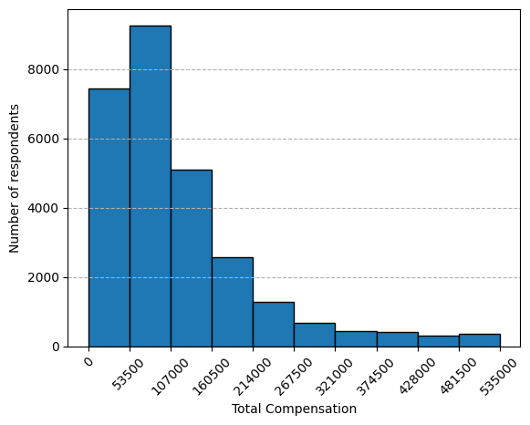
1.1 Histogram of CompTotal (Total Compensation)
Objective: Plot a histogram of CompTotal to visualize the distribution of respondents' total compensation.
## Write your code here
QUERY = """
SELECT CompTotal
FROM main
"""

df = pd.read_sql_query(QUERY, conn).dropna()
doc = df.CompTotal
q1, q3 = doc.quantile(.25), doc.quantile(.75)
iqr = q3 - q1
outliers1 = doc[(doc > q3 + 1.5 * iqr) | (doc < q1 - 1.5 * iqr)].sort_values(ascending=False)
#print('Number of outliers in CompTotal:', outliers1.count())
df_o = df[~df['CompTotal'].isin(outliers1)]

count, bin_edges = np.histogram(df_o.CompTotal)
df_o.CompTotal.hist(edgecolor='black')
plt.xticks(bin_edges.round(decimals=0))
plt.xlabel('Total Compensation')
plt.xticks(rotation=45)
plt.grid(False)
plt.grid(True, axis='y', linestyle='dashed')
plt.ylabel('Number of respondents')
plt.show()
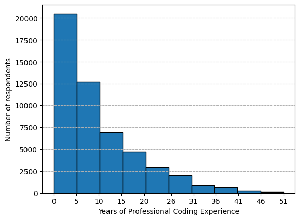
1.2 Histogram of YearsCodePro (Years of Professional Coding Experience)
Objective: Plot a histogram of YearsCodePro to analyze the distribution of coding experience among respondents.
## Write your code here
QUERY = """
SELECT YearsCodePro
FROM main
"""
df = pd.read_sql_query(QUERY, conn).dropna()
df = df.replace({'Less than 1 year': 0, 'More than 50 years': 51}).astype(int)
count, bin_edges = np.histogram(df.YearsCodePro)
df.YearsCodePro.hist(edgecolor='black')
plt.xticks(bin_edges.round(decimals=0))
plt.xlabel('Years of Professional Coding Experience')
plt.ylabel('Number of respondents')
plt.grid(False)
plt.grid(True, axis='y', linestyle='dashed')
plt.show()
2. Visualizing Relationships in Data
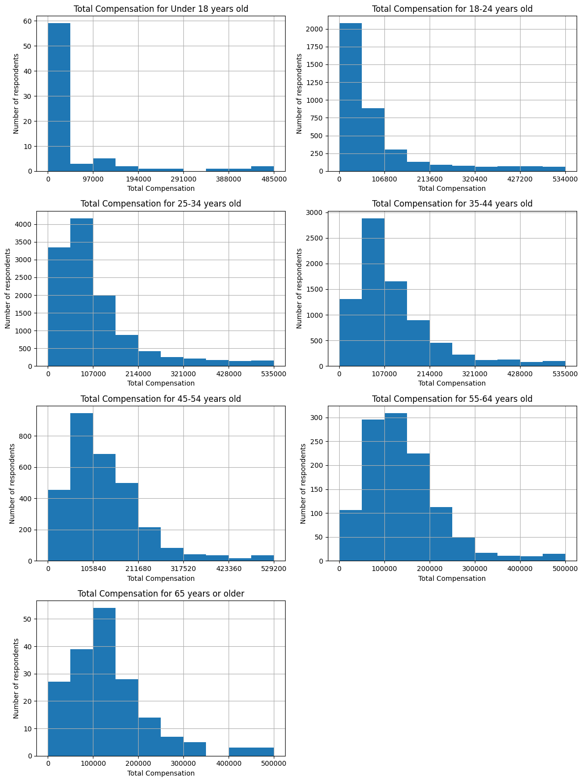
2.1 Histogram Comparison of CompTotal by Age Group
Objective: Use histograms to compare the distribution of CompTotal across different Age groups.
## Write your code here
QUERY = """
SELECT CompTotal, Age
FROM main
"""
df = pd.read_sql_query(QUERY, conn).dropna()
doc = df.CompTotal
q1, q3 = doc.quantile(.25), doc.quantile(.75)
iqr = q3 - q1
outliers1 = doc[(doc > q3 + 1.5 * iqr) | (doc < q1 - 1.5 * iqr)].sort_values(ascending=False)
#print('Number of outliers in CompTotal:', outliers1.count())
df_o = df[~df['CompTotal'].isin(outliers1)]
#print(df_o['CompTotal'].describe())
groups = ['Under 18 years old', '18-24 years old', '25-34 years old', '35-44 years old', '45-54 years old',
          '55-64 years old', '65 years or older']

fig, axes = plt.subplots(nrows=4, ncols=2, figsize=(12, 16))
axes = axes.flatten()  # make it easier to index

for i, g in enumerate(groups):
    ax = axes[i]
    count, bin_edges = np.histogram(df_o[df_o['Age'] == g]['CompTotal'], bins=10)
    df_o[df_o['Age'] == g]['CompTotal'].hist(ax=ax)
    ax.set_xticks(bin_edges[::2].round(decimals=0))
    ax.set_title(f'Total Compensation for {g}')
    ax.set_xlabel('Total Compensation')
    ax.set_ylabel('Number of respondents')

# Hide the unused subplot (last one)
if len(groups) < len(axes):
    axes[-1].set_visible(False)

plt.tight_layout()
plt.show()
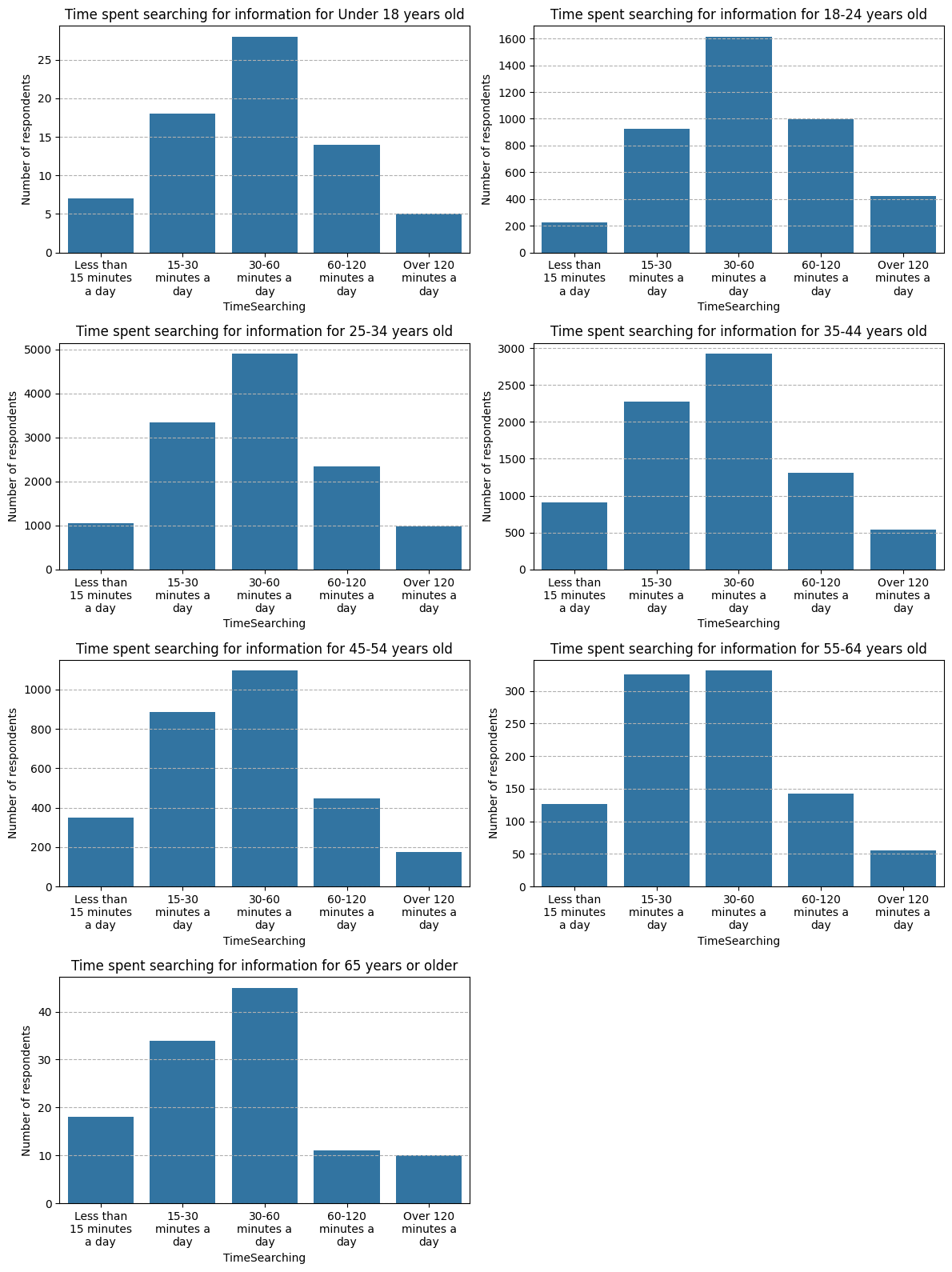
2.2 Histogram of TimeSearching for Different Age Groups
Objective: Use histograms to explore the distribution of TimeSearching (time spent searching for information) for respondents across different age groups.
## Write your code here
QUERY = """
SELECT TimeSearching, Age
FROM main
"""
df = pd.read_sql_query(QUERY, conn).dropna()
#print(df.TimeSearching.unique())
agegroups = ['Under 18 years old', '18-24 years old', '25-34 years old', '35-44 years old', '45-54 years old',
             '55-64 years old', '65 years or older']
timegroups = ['Less than 15 minutes a day', '15-30 minutes a day', '30-60 minutes a day', '60-120 minutes a day',
              'Over 120 minutes a day']

fig, axes = plt.subplots(nrows=4, ncols=2, figsize=(12, 16))
axes = axes.flatten()  # make it easier to index

for i, g in enumerate(agegroups):
    ax = axes[i]
    sns.barplot(data=df[df['Age'] == g]['TimeSearching'].value_counts(sort=False), ax=ax, order=timegroups)
    ax.set_title(f'Time spent searching for information for {g}')
    ax.set_xticks(range(len(timegroups)))
    wrapped = [textwrap.fill(label, width=10) for label in timegroups]
    ax.set_xticklabels(wrapped)
    ax.grid(True, axis='y', linestyle='dashed')
    ax.set_xlabel('TimeSearching')
    ax.set_ylabel('Number of respondents')

# Hide the unused subplot (last one)
if len(agegroups) < len(axes):
    axes[-1].set_visible(False)

plt.tight_layout()
plt.show()
3. Visualizing the Composition of Data
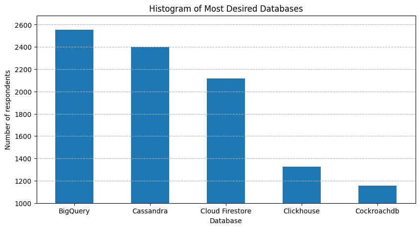
3.1 Histogram of Most Desired Databases (DatabaseWantToWorkWith)
Objective: Visualize the most desired databases for future learning using a histogram of the top 5 databases.
## Write your code here
QUERY = """
SELECT DatabaseWantToWorkWith
FROM main
"""
df = pd.read_sql_query(QUERY, conn).dropna()
datab = df.copy()
dummiesdatab = datab['DatabaseWantToWorkWith'].str.get_dummies(sep=';')
datab = dummiesdatab.agg('sum').T.head().sort_values(ascending=False)

datab.plot(kind='bar', x=datab.index, y=datab, figsize=(10, 5))

plt.title('Histogram of Most Desired Databases')
plt.grid(True, axis='y', linestyle='dashed')
plt.xticks(rotation=0)
plt.ylim(1000,)
plt.xlabel('Database')
plt.ylabel('Number of respondents')

plt.show()
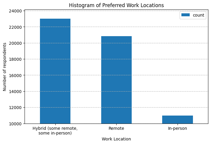
3.2 Histogram of Preferred Work Locations (RemoteWork)
Objective: Use a histogram to explore the distribution of preferred work arrangements (remote work).
## Write your code here
QUERY = """
SELECT RemoteWork
FROM main
"""
df = pd.read_sql_query(QUERY, conn).dropna()
print(df.RemoteWork.unique())
<StringArray>
['Remote', 'In-person', 'Hybrid (some remote, some in-person)']
Length: 3, dtype: str
dfh = pd.DataFrame(df.value_counts()).reset_index()
ax = dfh.plot(kind='bar', x='RemoteWork', y='count', figsize=(8, 5))

ax.set_title('Histogram of Preferred Work Locations')
ax.grid(True, axis='y', linestyle='dashed')
ax.set_xticks(range(len(dfh['RemoteWork'])))
wrapped = [textwrap.fill(label, width=20) for label in dfh['RemoteWork']]
ax.set_xticklabels(wrapped, rotation=0)
ax.set_ylim(10000,)
ax.set_xlabel('Work Location')
ax.set_ylabel('Number of respondents')

plt.show()
4. Visualizing Comparison of Data
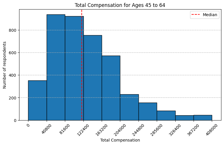
4.1 Histogram of Median CompTotal for Ages 45 to 60
Objective: Plot the histogram for CompTotal within the age group 45 to 60 to analyze compensation distribution among mid-career respondents.
## Write your code here
QUERY = """
SELECT CompTotal
FROM main
WHERE Age in ('45-54 years old', '55-64 years old')
"""
df = pd.read_sql_query(QUERY, conn).dropna()
doc = df.CompTotal
q1, q3 = doc.quantile(.25), doc.quantile(.75)
iqr = q3 - q1
outliers1 = doc[(doc > q3 + 1.5 * iqr) | (doc < q1 - 1.5 * iqr)].sort_values(ascending=False)
#print('Number of outliers in CompTotal:', outliers1.count())
df_o = df[~df['CompTotal'].isin(outliers1)]
#print(df_o['CompTotal'].describe())
count, bin_edges = np.histogram(df_o.CompTotal)
df_o.CompTotal.hist(edgecolor='black', figsize=(9, 5))
plt.title('Total Compensation for Ages 45 to 64')
plt.xticks(bin_edges.round(decimals=0))
plt.xticks(rotation=45)
plt.axvline(x=df_o.CompTotal.median(), color='r', linestyle='--', label='Median')
plt.xlabel('Total Compensation')
plt.ylabel('Number of respondents')
plt.grid(False)
plt.grid(True, axis='y', linestyle='dashed')
plt.legend(loc='best')
plt.show()
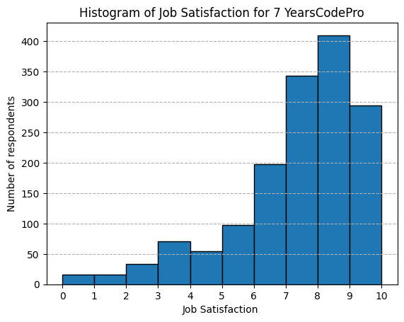
4.2 Histogram of Job Satisfaction (JobSat) by YearsCodePro
Objective: Plot the histogram for JobSat scores based on respondents' years of professional coding experience.
## Write your code here
QUERY = """
SELECT JobSat, YearsCodePro
FROM main
"""
df = pd.read_sql_query(QUERY, conn).dropna()
#df.describe(include='all')
print(list(df.YearsCodePro.unique()))
['12', '27', '10', 'Less than 1 year', '18', '15', '17', '6', '7', '16', '14', '4', '8', '2', '29', '5', '30', '1', '25', '24', '26', '9', '20', '37', '11', '3', '13', '19', '21', '23', '34', '28', '32', '22', '33', '40', '39', '31', '35', '41', '38', 'More than 50 years', '36', '43', '42', '50', '45', '44', '46', '48', '47', '49']
exp = '7'
dfh = df[df['YearsCodePro'] == exp]['JobSat']
dfh.hist(edgecolor='black')
plt.title(f'Histogram of Job Satisfaction for {exp} YearsCodePro')
plt.xlabel('Job Satisfaction ')
plt.xticks(range(0, 11))
plt.ylabel('Number of respondents')
plt.grid(False)
plt.grid(True, axis='y', linestyle='dashed')
plt.show()
Final step: Close the database connection
Once you've completed the lab, make sure to close the connection to the SQLite database:
conn.close()
Summary
In this lab, you used histograms to visualize various aspects of the dataset, focusing on:
-
Distribution of compensation, coding experience, and work hours.
-
Relationships in compensation across age groups and work status.
-
Composition of data by desired databases and work environments.
-
Comparisons of job satisfaction across years of experience.
Histograms helped reveal patterns and distributions in the data, enhancing your understanding of developer demographics and preferences.
Authors:
Ayushi Jain
Other Contributors:
- Rav Ahuja
- Lakshmi Holla
- Malika
Copyright © IBM Corporation. All rights reserved.