
Scatter Plot
Estimated time needed: 45 minutes
Overview
In this lab, you will focus on creating and interpreting scatter plots to visualize relationships between variables and trends in the dataset. The provided dataset will be directly loaded into a pandas DataFrame, and various scatter plot-related visualizations will be created to explore developer trends, compensation, and preferences.
Objectives
In this lab, you will:
-
Create and analyze scatter plots to examine relationships between variables.
-
Use scatter plots to identify trends and patterns in the dataset.
-
Focus on visualizations centered on scatter plots for better data-driven insights.
Setup: Working with the Database
Install and import the required libraries
!pip install pandas
!pip install matplotlib
!pip install seaborn

import pandas as pd
import matplotlib.pyplot as plt
import seaborn as sns
import textwrap
import numpy as np
Requirement already satisfied: pandas in /opt/conda/lib/python3.12/site-packages (3.0.0)
Requirement already satisfied: numpy>=1.26.0 in /opt/conda/lib/python3.12/site-packages (from pandas) (2.4.2)
Requirement already satisfied: python-dateutil>=2.8.2 in /opt/conda/lib/python3.12/site-packages (from pandas) (2.9.0.post0)
Requirement already satisfied: six>=1.5 in /opt/conda/lib/python3.12/site-packages (from python-dateutil>=2.8.2->pandas) (1.17.0)
Requirement already satisfied: matplotlib in /opt/conda/lib/python3.12/site-packages (3.10.8)
Requirement already satisfied: contourpy>=1.0.1 in /opt/conda/lib/python3.12/site-packages (from matplotlib) (1.3.3)
Requirement already satisfied: cycler>=0.10 in /opt/conda/lib/python3.12/site-packages (from matplotlib) (0.12.1)
Requirement already satisfied: fonttools>=4.22.0 in /opt/conda/lib/python3.12/site-packages (from matplotlib) (4.61.1)
Requirement already satisfied: kiwisolver>=1.3.1 in /opt/conda/lib/python3.12/site-packages (from matplotlib) (1.4.9)
Requirement already satisfied: numpy>=1.23 in /opt/conda/lib/python3.12/site-packages (from matplotlib) (2.4.2)
Requirement already satisfied: packaging>=20.0 in /opt/conda/lib/python3.12/site-packages (from matplotlib) (24.2)
Requirement already satisfied: pillow>=8 in /opt/conda/lib/python3.12/site-packages (from matplotlib) (12.1.0)
Requirement already satisfied: pyparsing>=3 in /opt/conda/lib/python3.12/site-packages (from matplotlib) (3.3.2)
Requirement already satisfied: python-dateutil>=2.7 in /opt/conda/lib/python3.12/site-packages (from matplotlib) (2.9.0.post0)
Requirement already satisfied: six>=1.5 in /opt/conda/lib/python3.12/site-packages (from python-dateutil>=2.7->matplotlib) (1.17.0)
Requirement already satisfied: seaborn in /opt/conda/lib/python3.12/site-packages (0.13.2)
Requirement already satisfied: numpy!=1.24.0,>=1.20 in /opt/conda/lib/python3.12/site-packages (from seaborn) (2.4.2)
Requirement already satisfied: pandas>=1.2 in /opt/conda/lib/python3.12/site-packages (from seaborn) (3.0.0)
Requirement already satisfied: matplotlib!=3.6.1,>=3.4 in /opt/conda/lib/python3.12/site-packages (from seaborn) (3.10.8)
Requirement already satisfied: contourpy>=1.0.1 in /opt/conda/lib/python3.12/site-packages (from matplotlib!=3.6.1,>=3.4->seaborn) (1.3.3)
Requirement already satisfied: cycler>=0.10 in /opt/conda/lib/python3.12/site-packages (from matplotlib!=3.6.1,>=3.4->seaborn) (0.12.1)
Requirement already satisfied: fonttools>=4.22.0 in /opt/conda/lib/python3.12/site-packages (from matplotlib!=3.6.1,>=3.4->seaborn) (4.61.1)
Requirement already satisfied: kiwisolver>=1.3.1 in /opt/conda/lib/python3.12/site-packages (from matplotlib!=3.6.1,>=3.4->seaborn) (1.4.9)
Requirement already satisfied: packaging>=20.0 in /opt/conda/lib/python3.12/site-packages (from matplotlib!=3.6.1,>=3.4->seaborn) (24.2)
Requirement already satisfied: pillow>=8 in /opt/conda/lib/python3.12/site-packages (from matplotlib!=3.6.1,>=3.4->seaborn) (12.1.0)
Requirement already satisfied: pyparsing>=3 in /opt/conda/lib/python3.12/site-packages (from matplotlib!=3.6.1,>=3.4->seaborn) (3.3.2)
Requirement already satisfied: python-dateutil>=2.7 in /opt/conda/lib/python3.12/site-packages (from matplotlib!=3.6.1,>=3.4->seaborn) (2.9.0.post0)
Requirement already satisfied: six>=1.5 in /opt/conda/lib/python3.12/site-packages (from python-dateutil>=2.7->matplotlib!=3.6.1,>=3.4->seaborn) (1.17.0)
Step 1: Load the dataset
file_path = "https://cf-courses-data.s3.us.cloud-object-storage.appdomain.cloud/n01PQ9pSmiRX6520flujwQ/survey-data.csv"

df = pd.read_csv(file_path)
print(df.info())
print('Initial dataframe:', df.shape)
<class 'pandas.DataFrame'>
RangeIndex: 65437 entries, 0 to 65436
Columns: 114 entries, ResponseId to JobSat
dtypes: float64(13), int64(1), str(100)
memory usage: 56.9 MB
None
Initial dataframe: (65437, 114)
Task 1: Exploring Relationships with Scatter Plots
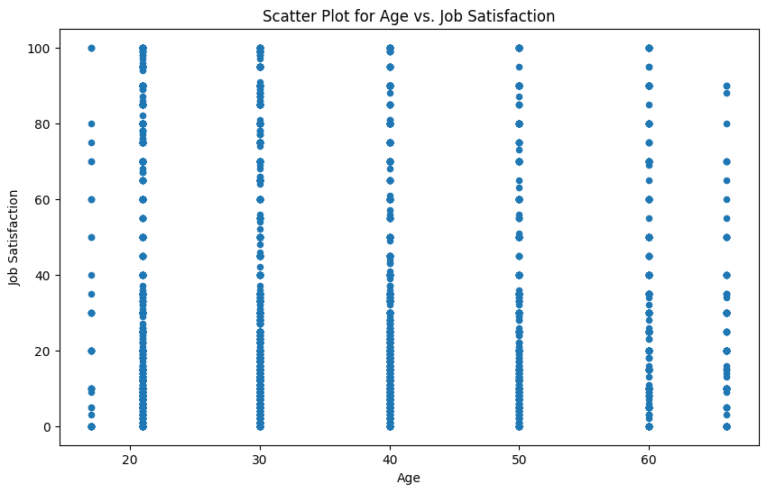
1. Scatter Plot for Age vs. Job Satisfaction
Visualize the relationship between respondents' age (Age) and job satisfaction (JobSatPoints_6). Use this plot to identify any patterns or trends.
## Write your code here
df_ajs = df[['Age', 'JobSatPoints_6']].dropna()
df_ajs.Age = df_ajs.Age.map({'Under 18 years old': 17, '18-24 years old': 21, 'Prefer not to say': float('nan'),
        '25-34 years old': 30, '35-44 years old': 40, '45-54 years old': 50,
        '55-64 years old': 60, '65 years or older': 66})
#df_ajs.describe()
df_ajs.plot(kind='scatter', x='Age', y='JobSatPoints_6', figsize=(10, 6))

plt.title('Scatter Plot for Age vs. Job Satisfaction')
plt.xlabel('Age')
plt.ylabel('Job Satisfaction')

plt.show()
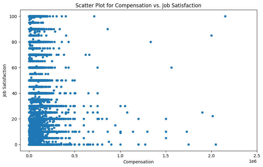
2. Scatter Plot for Compensation vs. Job Satisfaction
Explore the relationship between yearly compensation (ConvertedCompYearly) and job satisfaction (JobSatPoints_6) using a scatter plot.
## Write your code here
df_cjs = df[['ConvertedCompYearly', 'JobSatPoints_6']].dropna()
#df_cjs.describe()
df_cjs.plot(kind='scatter', x='ConvertedCompYearly', y='JobSatPoints_6', figsize=(10, 6))

plt.title('Scatter Plot for Compensation vs. Job Satisfaction')
plt.xlabel('Compensation')
plt.ylabel('Job Satisfaction')
plt.xlim(-(10**5), 2.5 * 10**6)

plt.show()
Task 2: Enhancing Scatter Plots
1. Scatter Plot with Trend Line for Age vs. Job Satisfaction
Add a regression line to the scatter plot of Age vs. JobSatPoints_6 to highlight trends in the data.
## Write your code here
df_ajs = df_ajs.dropna()
x = df_ajs['Age']      # year on x-axis
y = df_ajs['JobSatPoints_6']     # total on y-axis
fit = np.polyfit(x, y, deg=1)
fit
array([-0.14001631, 29.20500555])
df_ajs.plot(kind='scatter', x='Age', y='JobSatPoints_6', figsize=(10, 6))
plt.title('Scatter Plot for Age vs. Job Satisfaction')
plt.xlabel('Age')
plt.ylabel('Job Satisfaction')

plt.plot(x, fit[0] * x + fit[1], color='red') # recall that x is the Years
rsq = df_ajs.corr().loc['Age', 'JobSatPoints_6'] ** 2
plt.annotate('y={0:.3f} x + {1:.2f}, R^2 = {2:.4f}'.format(fit[0], fit[1], rsq), xy=(40, 19))

plt.show()

# print out the line of best fit
print('Job Satisfaction = {0:.3f} * Year + {1:.2f}, R^2 = {2:.4f}'.format(fit[0], fit[1], rsq))
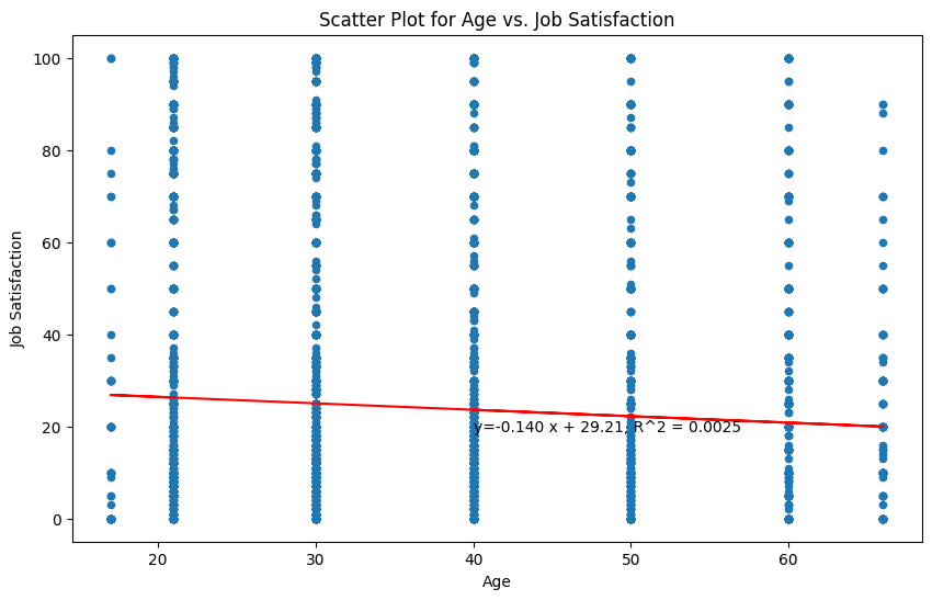
Job Satisfaction = -0.140 * Year + 29.21, R^2 = 0.0025
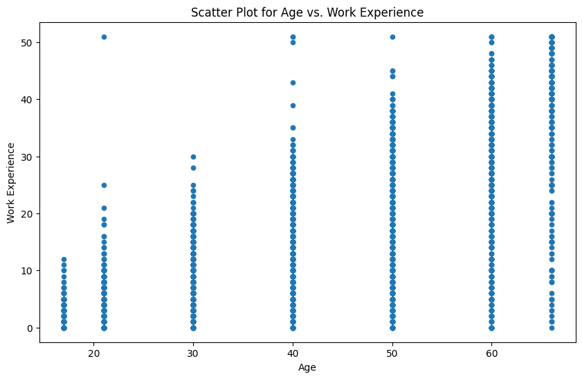
2. Scatter Plot for Age vs. Work Experience
Visualize the relationship between Age (Age) and Work Experience (YearsCodePro) using a scatter plot.
## Write your code here
df_awe = df[['Age', 'YearsCodePro']].dropna()
df_awe.Age = df_awe.Age.map({'Under 18 years old': 17, '18-24 years old': 21, 'Prefer not to say': float('nan'),
        '25-34 years old': 30, '35-44 years old': 40, '45-54 years old': 50,
        '55-64 years old': 60, '65 years or older': 66})
df_awe.YearsCodePro = df_awe.YearsCodePro.replace({'Less than 1 year': 0, 'More than 50 years': 51}).astype(int)
print(sorted(df_awe.Age.unique().tolist()))
[17.0, 21.0, 30.0, 40.0, 50.0, 60.0, nan, 66.0]
df_awe.plot(kind='scatter', x='Age', y='YearsCodePro', figsize=(10, 6))

plt.title('Scatter Plot for Age vs. Work Experience')
plt.xlabel('Age')
plt.ylabel('Work Experience')

plt.show()
Task 3: Combining Scatter Plots with Additional Features
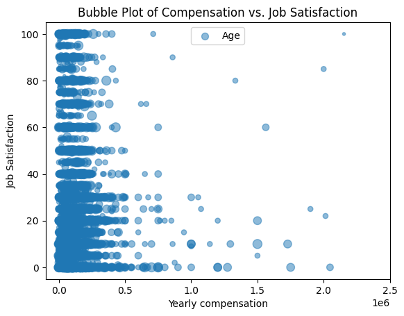
1. Bubble Plot of Compensation vs. Job Satisfaction with Age as Bubble Size
Create a bubble plot to explore the relationship between yearly compensation (ConvertedCompYearly) and job satisfaction (JobSatPoints_6), with bubble size representing age.
## Write your code here
df_cjsa = df[['Age', 'JobSatPoints_6', 'ConvertedCompYearly']].dropna()
df_cjsa.Age = df_cjsa.Age.map({'Under 18 years old': 17, '18-24 years old': 21, 'Prefer not to say': float('nan'),
        '25-34 years old': 30, '35-44 years old': 40, '45-54 years old': 50,
        '55-64 years old': 60, '65 years or older': 66})
#df_cjsa.describe()
norm_age = (df_cjsa.Age - df_cjsa.Age.min()) / (df_cjsa.Age.max() - df_cjsa.Age.min())
ax = df_cjsa.plot(kind='scatter',
            x='ConvertedCompYearly',
            y='JobSatPoints_6',
            alpha=0.5,
            s=norm_age * 100 + 1)

ax.set_ylabel('Job Satisfaction')
ax.set_xlabel('Yearly compensation')
ax.set_xlim(-(10**5), 2.5 * 10**6)
ax.legend(['Age'], loc='upper center')
ax.set_title('Bubble Plot of Compensation vs. Job Satisfaction')
Text(0.5, 1.0, 'Bubble Plot of Compensation vs. Job Satisfaction')
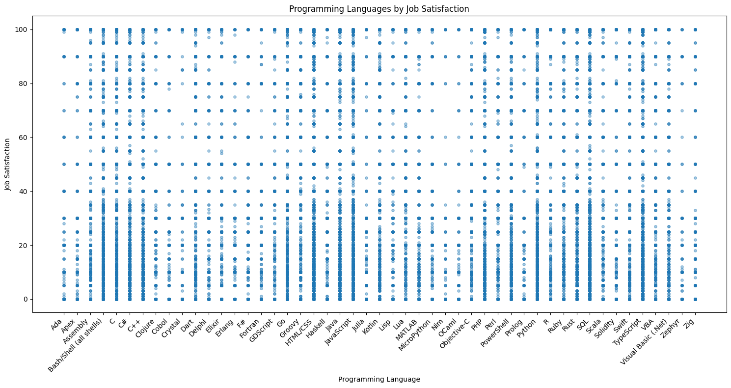
2. Scatter Plot for Popular Programming Languages by Job Satisfaction
Visualize the popularity of programming languages (LanguageHaveWorkedWith) against job satisfaction using a scatter plot. Use points to represent satisfaction levels for each language.
## Write your code here
df_pljs = df[['LanguageHaveWorkedWith', 'JobSatPoints_6']].dropna()

# Split the language list into rows
df_expanded = (
    df_pljs.assign(Language=df["LanguageHaveWorkedWith"].str.split(";"))
      .explode("Language")
      .dropna(subset=["Language"]))
# Clean whitespace
df_expanded["Language"] = df_expanded["Language"].str.strip()
#df_expanded
df_expanded = df_expanded.sort_values(by=["Language"])
#norm_sat = (df_expanded.JobSatPoints_6 - df_expanded.JobSatPoints_6.min()) / (df_expanded.JobSatPoints_6.max() - df_expanded.JobSatPoints_6.min())

# Scatter plot
plt.figure(figsize=(15, 8))
plt.scatter(
    x=df_expanded["Language"],
    y=df_expanded["JobSatPoints_6"],
    alpha=0.4,
    s=15)

plt.xticks(rotation=45, ha="right")
plt.ylabel("Job Satisfaction")
plt.xlabel("Programming Language")
plt.title("Programming Languages by Job Satisfaction")
plt.tight_layout()
plt.show()
Task 4: Scatter Plot Comparisons Across Groups
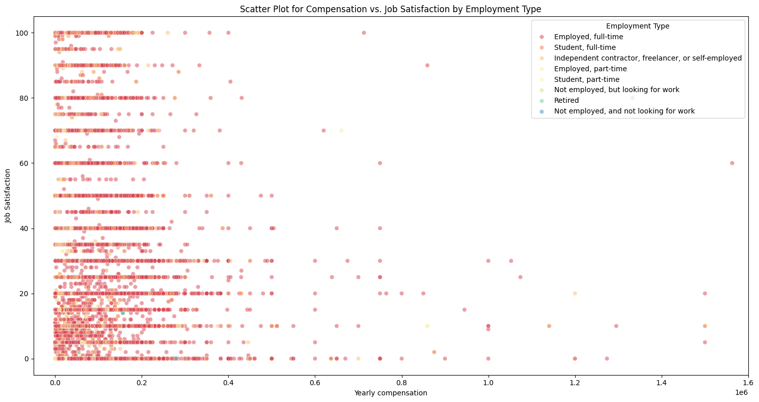
1. Scatter Plot for Compensation vs. Job Satisfaction by Employment Type
Visualize the relationship between yearly compensation (ConvertedCompYearly) and job satisfaction (JobSatPoints_6), categorized by employment type (Employment). Use color coding or markers to differentiate between employment types.
## Write your code here
df_cse = df[['Employment', 'JobSatPoints_6', 'ConvertedCompYearly']].dropna()
# Split the Employment list into rows
df_expanded = (
    df_cse.assign(EmplType=df["Employment"].str.split(";"))
      .explode("EmplType")
      .dropna(subset=["EmplType"]))
# Clean whitespace
df_expanded["EmplType"] = df_expanded["EmplType"].str.strip()
#df_expanded
plt.figure(figsize=(15, 8))
sns.scatterplot(data=df_expanded,
    x="ConvertedCompYearly",
    y="JobSatPoints_6",
    hue="EmplType",
    palette="Spectral",
    alpha=0.5)

plt.ylabel("Job Satisfaction")
plt.xlabel("Yearly compensation")
plt.xlim(-(0.5 * 10**5), 1.6 * 10**6)
plt.legend(title="Employment Type")
plt.title("Scatter Plot for Compensation vs. Job Satisfaction by Employment Type")
plt.tight_layout()
plt.show()
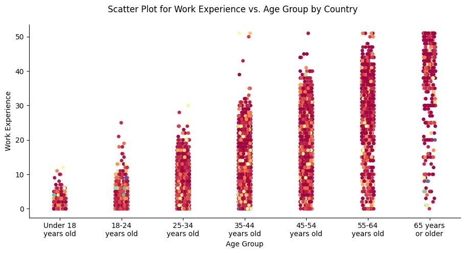
2. Scatter Plot for Work Experience vs. Age Group by Country
Compare work experience (YearsCodePro) across different age groups (Age) and countries (Country). Use colors to represent different countries and markers for age groups.
## Write your code here
df_eac = df[['Age', 'YearsCodePro', 'Country']].dropna()
df_eac.YearsCodePro = df_eac.YearsCodePro.replace({'Less than 1 year': 0, 'More than 50 years': 51}).astype(int)
print(sorted(df_eac.Age.unique().tolist()))
['18-24 years old', '25-34 years old', '35-44 years old', '45-54 years old', '55-64 years old', '65 years or older', 'Prefer not to say', 'Under 18 years old']
order = ['Under 18 years old', '18-24 years old', '25-34 years old', '35-44 years old',
        '45-54 years old', '55-64 years old', '65 years or older']
ax = sns.catplot(
    data=df_eac,
    order=order,
    x="Age",
    y="YearsCodePro",
    hue="Country",
    palette="Spectral",
    kind="strip")

xlabels = [textwrap.fill(label.get_text(), width=10) for label in ax.ax.get_xticklabels()]
ax.set_xticklabels(xlabels)
ax.set_axis_labels("Age Group", "Work Experience")
ax.fig.suptitle("Scatter Plot for Work Experience vs. Age Group by Country")
ax.fig.tight_layout()

# Remove the original legend
ax._legend.remove()
/opt/conda/lib/python3.12/site-packages/seaborn/axisgrid.py:123: UserWarning: Tight layout not applied. The bottom and top margins cannot be made large enough to accommodate all Axes decorations.
  self._figure.tight_layout(*args, **kwargs)
Final Step: Review
With these scatter plots, you will have analyzed data relationships across multiple dimensions, including compensation, job satisfaction, employment types, and demographics, to uncover meaningful trends in the developer community.
Summary
After completing this lab, you will be able to:
- Analyze how numerical variables relate across specific groups, such as employment types and countries.
- Use scatter plots effectively to represent multiple variables with color, size, and markers.
- Gain insights into compensation, satisfaction, and demographic trends using advanced scatter plot techniques.
Authors:
Ayushi Jain
Other Contributors:
- Rav Ahuja
- Lakshmi Holla
- Malika
Copyright © IBM Corporation. All rights reserved.