
Stacked Charts
Estimated time needed: 45 minutes
In this lab, you will focus on visualizing data specifically using stacked charts. You will use SQL queries to extract the necessary data and apply stacked charts to analyze the composition and comparison within the data.
Objectives
In this lab, you will perform the following:
-
Visualize the composition of data using stacked charts.
-
Compare multiple variables across different categories using stacked charts.
-
Analyze trends within stacked chart visualizations.
Setup: Downloading and Loading the Data
Install the libraries
!pip install pandas
Collecting pandas
Downloading pandas-3.0.0-cp312-cp312-manylinux_2_24_x86_64.manylinux_2_28_x86_64.whl.metadata (79 kB)
Collecting numpy>=1.26.0 (from pandas)
Downloading numpy-2.4.2-cp312-cp312-manylinux_2_27_x86_64.manylinux_2_28_x86_64.whl.metadata (6.6 kB)
Requirement already satisfied: python-dateutil>=2.8.2 in /opt/conda/lib/python3.12/site-packages (from pandas) (2.9.0.post0)
Requirement already satisfied: six>=1.5 in /opt/conda/lib/python3.12/site-packages (from python-dateutil>=2.8.2->pandas) (1.17.0)
Downloading pandas-3.0.0-cp312-cp312-manylinux_2_24_x86_64.manylinux_2_28_x86_64.whl (10.9 MB)
[2K [90m━━━━━━━━━━━━━━━━━━━━━━━━━━━━━━━━━━━━━━━━[0m [32m10.9/10.9 MB[0m [31m152.1 MB/s[0m eta [36m0:00:00[0m
[?25hDownloading numpy-2.4.2-cp312-cp312-manylinux_2_27_x86_64.manylinux_2_28_x86_64.whl (16.6 MB)
[2K [90m━━━━━━━━━━━━━━━━━━━━━━━━━━━━━━━━━━━━━━━━[0m [32m16.6/16.6 MB[0m [31m185.6 MB/s[0m eta [36m0:00:00[0m
Installing collected packages: numpy, pandas
Successfully installed numpy-2.4.2 pandas-3.0.0
!pip install matplotlib
!pip install seaborn
Collecting matplotlib
Downloading matplotlib-3.10.8-cp312-cp312-manylinux2014_x86_64.manylinux_2_17_x86_64.whl.metadata (52 kB)
Collecting contourpy>=1.0.1 (from matplotlib)
Downloading contourpy-1.3.3-cp312-cp312-manylinux_2_27_x86_64.manylinux_2_28_x86_64.whl.metadata (5.5 kB)
Collecting cycler>=0.10 (from matplotlib)
Downloading cycler-0.12.1-py3-none-any.whl.metadata (3.8 kB)
Collecting fonttools>=4.22.0 (from matplotlib)
Downloading fonttools-4.61.1-cp312-cp312-manylinux1_x86_64.manylinux2014_x86_64.manylinux_2_17_x86_64.manylinux_2_5_x86_64.whl.metadata (114 kB)
Collecting kiwisolver>=1.3.1 (from matplotlib)
Downloading kiwisolver-1.4.9-cp312-cp312-manylinux2014_x86_64.manylinux_2_17_x86_64.whl.metadata (6.3 kB)
Requirement already satisfied: numpy>=1.23 in /opt/conda/lib/python3.12/site-packages (from matplotlib) (2.4.2)
Requirement already satisfied: packaging>=20.0 in /opt/conda/lib/python3.12/site-packages (from matplotlib) (24.2)
Collecting pillow>=8 (from matplotlib)
Downloading pillow-12.1.1-cp312-cp312-manylinux_2_27_x86_64.manylinux_2_28_x86_64.whl.metadata (8.8 kB)
Collecting pyparsing>=3 (from matplotlib)
Downloading pyparsing-3.3.2-py3-none-any.whl.metadata (5.8 kB)
Requirement already satisfied: python-dateutil>=2.7 in /opt/conda/lib/python3.12/site-packages (from matplotlib) (2.9.0.post0)
Requirement already satisfied: six>=1.5 in /opt/conda/lib/python3.12/site-packages (from python-dateutil>=2.7->matplotlib) (1.17.0)
Downloading matplotlib-3.10.8-cp312-cp312-manylinux2014_x86_64.manylinux_2_17_x86_64.whl (8.7 MB)
[2K [90m━━━━━━━━━━━━━━━━━━━━━━━━━━━━━━━━━━━━━━━━[0m [32m8.7/8.7 MB[0m [31m153.0 MB/s[0m eta [36m0:00:00[0m
[?25hDownloading contourpy-1.3.3-cp312-cp312-manylinux_2_27_x86_64.manylinux_2_28_x86_64.whl (362 kB)
Downloading cycler-0.12.1-py3-none-any.whl (8.3 kB)
Downloading fonttools-4.61.1-cp312-cp312-manylinux1_x86_64.manylinux2014_x86_64.manylinux_2_17_x86_64.manylinux_2_5_x86_64.whl (5.0 MB)
[2K [90m━━━━━━━━━━━━━━━━━━━━━━━━━━━━━━━━━━━━━━━━[0m [32m5.0/5.0 MB[0m [31m141.6 MB/s[0m eta [36m0:00:00[0m
[?25hDownloading kiwisolver-1.4.9-cp312-cp312-manylinux2014_x86_64.manylinux_2_17_x86_64.whl (1.5 MB)
[2K [90m━━━━━━━━━━━━━━━━━━━━━━━━━━━━━━━━━━━━━━━━[0m [32m1.5/1.5 MB[0m [31m82.9 MB/s[0m eta [36m0:00:00[0m
[?25hDownloading pillow-12.1.1-cp312-cp312-manylinux_2_27_x86_64.manylinux_2_28_x86_64.whl (7.0 MB)
[2K [90m━━━━━━━━━━━━━━━━━━━━━━━━━━━━━━━━━━━━━━━━[0m [32m7.0/7.0 MB[0m [31m150.5 MB/s[0m eta [36m0:00:00[0m
[?25hDownloading pyparsing-3.3.2-py3-none-any.whl (122 kB)
Installing collected packages: pyparsing, pillow, kiwisolver, fonttools, cycler, contourpy, matplotlib
Successfully installed contourpy-1.3.3 cycler-0.12.1 fonttools-4.61.1 kiwisolver-1.4.9 matplotlib-3.10.8 pillow-12.1.1 pyparsing-3.3.2
Collecting seaborn
Downloading seaborn-0.13.2-py3-none-any.whl.metadata (5.4 kB)
Requirement already satisfied: numpy!=1.24.0,>=1.20 in /opt/conda/lib/python3.12/site-packages (from seaborn) (2.4.2)
Requirement already satisfied: pandas>=1.2 in /opt/conda/lib/python3.12/site-packages (from seaborn) (3.0.0)
Requirement already satisfied: matplotlib!=3.6.1,>=3.4 in /opt/conda/lib/python3.12/site-packages (from seaborn) (3.10.8)
Requirement already satisfied: contourpy>=1.0.1 in /opt/conda/lib/python3.12/site-packages (from matplotlib!=3.6.1,>=3.4->seaborn) (1.3.3)
Requirement already satisfied: cycler>=0.10 in /opt/conda/lib/python3.12/site-packages (from matplotlib!=3.6.1,>=3.4->seaborn) (0.12.1)
Requirement already satisfied: fonttools>=4.22.0 in /opt/conda/lib/python3.12/site-packages (from matplotlib!=3.6.1,>=3.4->seaborn) (4.61.1)
Requirement already satisfied: kiwisolver>=1.3.1 in /opt/conda/lib/python3.12/site-packages (from matplotlib!=3.6.1,>=3.4->seaborn) (1.4.9)
Requirement already satisfied: packaging>=20.0 in /opt/conda/lib/python3.12/site-packages (from matplotlib!=3.6.1,>=3.4->seaborn) (24.2)
Requirement already satisfied: pillow>=8 in /opt/conda/lib/python3.12/site-packages (from matplotlib!=3.6.1,>=3.4->seaborn) (12.1.1)
Requirement already satisfied: pyparsing>=3 in /opt/conda/lib/python3.12/site-packages (from matplotlib!=3.6.1,>=3.4->seaborn) (3.3.2)
Requirement already satisfied: python-dateutil>=2.7 in /opt/conda/lib/python3.12/site-packages (from matplotlib!=3.6.1,>=3.4->seaborn) (2.9.0.post0)
Requirement already satisfied: six>=1.5 in /opt/conda/lib/python3.12/site-packages (from python-dateutil>=2.7->matplotlib!=3.6.1,>=3.4->seaborn) (1.17.0)
Downloading seaborn-0.13.2-py3-none-any.whl (294 kB)
Installing collected packages: seaborn
Successfully installed seaborn-0.13.2
Download and Load the Data
To start, download and load the dataset into a pandas DataFrame.
Step 1: Download the dataset
!wget -O survey-data.csv https://cf-courses-data.s3.us.cloud-object-storage.appdomain.cloud/n01PQ9pSmiRX6520flujwQ/survey-data.csv
--2026-02-11 07:51:32--  https://cf-courses-data.s3.us.cloud-object-storage.appdomain.cloud/n01PQ9pSmiRX6520flujwQ/survey-data.csv
Resolving cf-courses-data.s3.us.cloud-object-storage.appdomain.cloud (cf-courses-data.s3.us.cloud-object-storage.appdomain.cloud)... 169.63.118.104
Connecting to cf-courses-data.s3.us.cloud-object-storage.appdomain.cloud (cf-courses-data.s3.us.cloud-object-storage.appdomain.cloud)|169.63.118.104|:443... connected.
HTTP request sent, awaiting response... 200 OK
Length: 159525875 (152M) [text/csv]
Saving to: ‘survey-data.csv’

survey-data.csv     100%[===================>] 152.13M  38.8MB/s    in 3.8s

2026-02-11 07:51:37 (39.6 MB/s) - ‘survey-data.csv’ saved [159525875/159525875]
Step 2: Import necessary libraries and load the dataset
import pandas as pd
import matplotlib.pyplot as plt
import seaborn as sns
import textwrap
import numpy as np
Load the data
df = pd.read_csv("survey-data.csv")
Display the first few rows of the data to understand its structure
df.head()
| ResponseId | MainBranch | Age | Employment | RemoteWork | Check | CodingActivities | EdLevel | LearnCode | LearnCodeOnline | ... | JobSatPoints_6 | JobSatPoints_7 | JobSatPoints_8 | JobSatPoints_9 | JobSatPoints_10 | JobSatPoints_11 | SurveyLength | SurveyEase | ConvertedCompYearly | JobSat | |
|---|---|---|---|---|---|---|---|---|---|---|---|---|---|---|---|---|---|---|---|---|---|
| 0 | 1 | I am a developer by profession | Under 18 years old | Employed, full-time | Remote | Apples | Hobby | Primary/elementary school | Books / Physical media | NaN | ... | NaN | NaN | NaN | NaN | NaN | NaN | NaN | NaN | NaN | NaN |
| 1 | 2 | I am a developer by profession | 35-44 years old | Employed, full-time | Remote | Apples | Hobby;Contribute to open-source projects;Other... | Bachelor’s degree (B.A., B.S., B.Eng., etc.) | Books / Physical media;Colleague;On the job tr... | Technical documentation;Blogs;Books;Written Tu... | ... | 0.0 | 0.0 | 0.0 | 0.0 | 0.0 | 0.0 | NaN | NaN | NaN | NaN |
| 2 | 3 | I am a developer by profession | 45-54 years old | Employed, full-time | Remote | Apples | Hobby;Contribute to open-source projects;Other... | Master’s degree (M.A., M.S., M.Eng., MBA, etc.) | Books / Physical media;Colleague;On the job tr... | Technical documentation;Blogs;Books;Written Tu... | ... | NaN | NaN | NaN | NaN | NaN | NaN | Appropriate in length | Easy | NaN | NaN |
| 3 | 4 | I am learning to code | 18-24 years old | Student, full-time | NaN | Apples | NaN | Some college/university study without earning ... | Other online resources (e.g., videos, blogs, f... | Stack Overflow;How-to videos;Interactive tutorial | ... | NaN | NaN | NaN | NaN | NaN | NaN | Too long | Easy | NaN | NaN |
| 4 | 5 | I am a developer by profession | 18-24 years old | Student, full-time | NaN | Apples | NaN | Secondary school (e.g. American high school, G... | Other online resources (e.g., videos, blogs, f... | Technical documentation;Blogs;Written Tutorial... | ... | NaN | NaN | NaN | NaN | NaN | NaN | Too short | Easy | NaN | NaN |
5 rows × 114 columns
Task 1: Stacked Chart for Composition of Job Satisfaction Across Age Groups
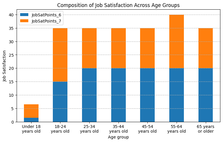
1. Stacked Chart of Median JobSatPoints_6 and JobSatPoints_7 for Different Age Groups
Visualize the composition of job satisfaction scores (JobSatPoints_6 and JobSatPoints_7) across various age groups. This will help in understanding the breakdown of satisfaction levels across different demographics.
##Write your code here
df_sa = df[["JobSatPoints_6", "JobSatPoints_7", "Age"]].groupby("Age", as_index=False).median()
order = [7, 0, 1, 2, 3, 4, 5]
df_sa = df_sa.reindex(order)
#df_sa
ax = df_sa.plot(kind="bar", x="Age", figsize=(9, 5), stacked=True)

xlabels = [textwrap.fill(label.get_text(), width=10) for label in ax.get_xticklabels()]
ax.set(xlabel="Age group", ylabel="Job Satisfaction")
ax.set_xticklabels(xlabels)
plt.title("Composition of Job Satisfaction Across Age Groups")
plt.xticks(rotation=0)
plt.grid(True, axis="y", linestyle="dashed")

plt.show()
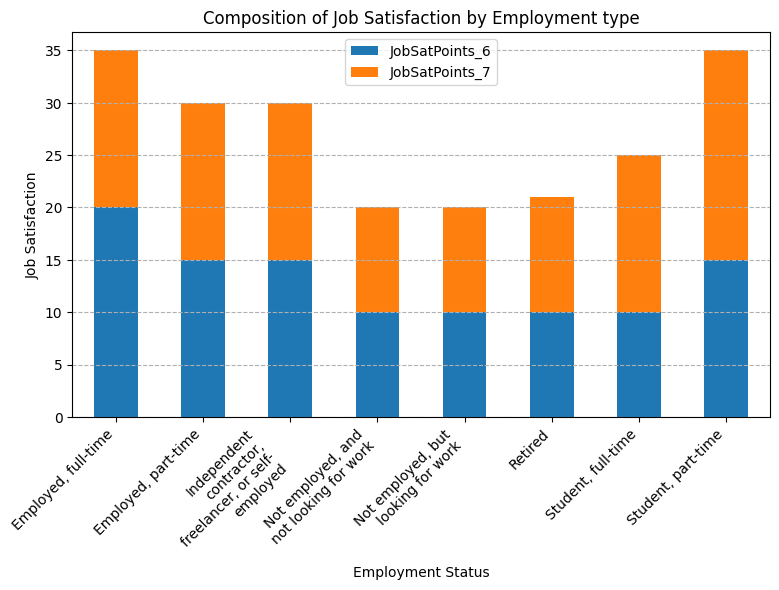
Stacked Chart of JobSatPoints_6 and JobSatPoints_7 for Employment Status
Create a stacked chart to compare job satisfaction (JobSatPoints_6 and JobSatPoints_7) across different employment statuses. This will show how satisfaction varies by employment type.
##Write your code here
df_se = df[["JobSatPoints_6", "JobSatPoints_7", "Employment"]]
# Split, explode, clean, aggregate
df_exp = (df_se.assign(Empl=df_se["Employment"].str.split(";"))
    .explode("Empl").dropna(subset=["Empl"]))
df_exp["Empl"] = df_exp["Empl"].str.strip()
df_exp = df_exp.drop(columns=["Employment"]).groupby(["Empl"], as_index=False).median()
df_exp = df_exp[df_exp.Empl != "I prefer not to say"]
#df_exp
ax = df_exp.plot(kind="bar", x="Empl", figsize=(9, 5), stacked=True)

xlabels = [textwrap.fill(label.get_text(), width=20) for label in ax.get_xticklabels()]
ax.set(xlabel="Employment Status", ylabel="Job Satisfaction")
ax.set_xticklabels(xlabels)
plt.title("Composition of Job Satisfaction by Employment type")
plt.xticks(rotation=45, ha="right")
plt.grid(True, axis="y", linestyle="dashed")

plt.show()
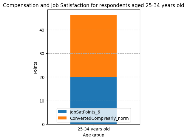
Task 2: Stacked Chart for Compensation and Job Satisfaction by Age Group
This stacked chart visualizes the composition of compensation (ConvertedCompYearly) and job satisfaction (JobSatPoints_6) specifically for respondents aged 30-35.
##Write your code here
#Removing outliers
doc = df.ConvertedCompYearly
q1, q3 = doc.quantile(.25), doc.quantile(.75)
iqr = q3 - q1
outliers = doc[(doc > q3 + 1.5 * iqr) | (doc < q1 - 1.5 * iqr)].sort_values(ascending=False)
df_o = df[~df['ConvertedCompYearly'].isin(outliers)]

df_cs = (df_o[df_o.Age == "25-34 years old"][["JobSatPoints_6", "ConvertedCompYearly", "Age"]]
         .groupby("Age", as_index=False).median())
df_cs["ConvertedCompYearly_norm"] = (100 * (df_cs.ConvertedCompYearly - df_o.ConvertedCompYearly.min()) /
                                     (df_o.ConvertedCompYearly.max() - df_o.ConvertedCompYearly.min()))
df_cs = df_cs.drop(columns="ConvertedCompYearly")
print(df_cs)
               Age  JobSatPoints_6  ConvertedCompYearly_norm
0  25-34 years old            20.0                 26.338519
ax = df_cs.plot(kind="bar", x="Age", figsize=(4, 5), stacked=True)

#xlabels = [textwrap.fill(label.get_text(), width=20) for label in ax.get_xticklabels()]
#ax.set_xticklabels(xlabels)
ax.set(xlabel="Age group", ylabel="Points")
ax.legend(loc='lower center')
plt.title("Compensation and Job Satisfaction for respondents aged 25-34 years old")
plt.xticks(rotation=0)
plt.grid(True, axis="y", linestyle="dashed")

plt.show()
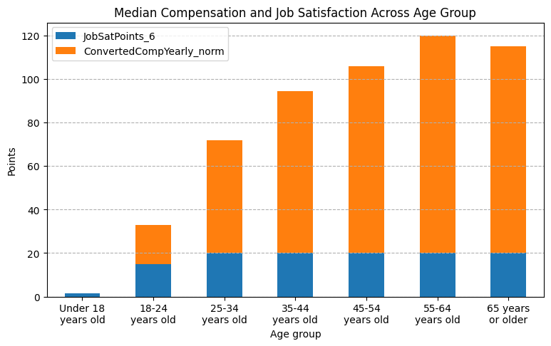
Stacked Chart of Median Compensation and Job Satisfaction Across Age Group
Compare the median compensation and job satisfaction metrics across different age groups. This helps visualize how compensation and satisfaction levels differ by age.
##Write your code here
df_cs = (df_o[["JobSatPoints_6", "ConvertedCompYearly", "Age"]]
         .groupby("Age", as_index=False).median())
order = [7, 0, 1, 2, 3, 4, 5]
df_cs = df_cs.reindex(order)
df_cs["ConvertedCompYearly_norm"] = (100 * (df_cs.ConvertedCompYearly - df_cs.ConvertedCompYearly.min()) /
                                     (df_cs.ConvertedCompYearly.max() - df_cs.ConvertedCompYearly.min()))
df_cs = df_cs.drop(columns="ConvertedCompYearly")
print(df_cs)
                  Age  JobSatPoints_6  ConvertedCompYearly_norm
7  Under 18 years old             1.5                  0.000000
0     18-24 years old            15.0                 17.856302
1     25-34 years old            20.0                 51.916683
2     35-44 years old            20.0                 74.423767
3     45-54 years old            20.0                 85.979109
4     55-64 years old            20.0                100.000000
5   65 years or older            20.0                 94.884753
ax = df_cs.plot(kind="bar", x="Age", figsize=(9, 5), stacked=True)

xlabels = [textwrap.fill(label.get_text(), width=10) for label in ax.get_xticklabels()]
ax.set(xlabel="Age group", ylabel="Points")
ax.set_xticklabels(xlabels)
plt.title("Median Compensation and Job Satisfaction Across Age Group")
plt.xticks(rotation=0)
plt.grid(True, axis="y", linestyle="dashed")

plt.show()
Task 3: Comparing Data Using Stacked Charts
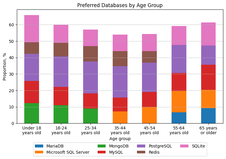
1. Stacked Chart of Preferred Databases by Age Group
Visualize the top databases that respondents from different age groups wish to learn. Create a stacked chart to show the proportion of each database in each age group.
##Write your code here "DatabaseWantToWorkWith"
df_da = df[df.Age != "Prefer not to say"][["DatabaseWantToWorkWith", "Age"]]
# Split, explode, clean, aggregate
df_exp = (df_da.assign(Database=df_da["DatabaseWantToWorkWith"].str.split(";"))
    .explode("Database").dropna(subset=["Database"]))
df_exp["Database"] = df_exp["Database"].str.strip()
df_exp = (df_exp.groupby(["Age", "Database"], as_index=False).size()
          .rename(columns={"size": "Respondents"})).sort_values(by=['Age', 'Respondents'], ascending=False)
df_exp["Proportion"] = (100 * df_exp["Respondents"] /df_exp.groupby("Age")["Respondents"].transform("sum"))
df_expc = pd.concat([df_exp[df_exp.Age == a].head() for a in df_exp.Age.unique()], ignore_index=True)
df_expc = df_expc.pivot(index="Age", columns="Database", values="Proportion").reset_index()
order = [6, 0, 1, 2, 3, 4, 5]
df_expc = df_expc.reindex(order)
#df_expc
ax = df_expc.plot(kind="bar", x="Age", figsize=(9, 5), stacked=True)

xlabels = [textwrap.fill(label.get_text(), width=10) for label in ax.get_xticklabels()]
ax.set(xlabel="Age group", ylabel="Proportion, %")
ax.set_xticklabels(xlabels)
plt.title("Preferred Databases by Age Group")
plt.xticks(rotation=0)
plt.grid(True, axis="y", linestyle="dashed")
ax.legend(loc='upper center', bbox_to_anchor=(0.5, -0.15), ncol=4)

plt.show()
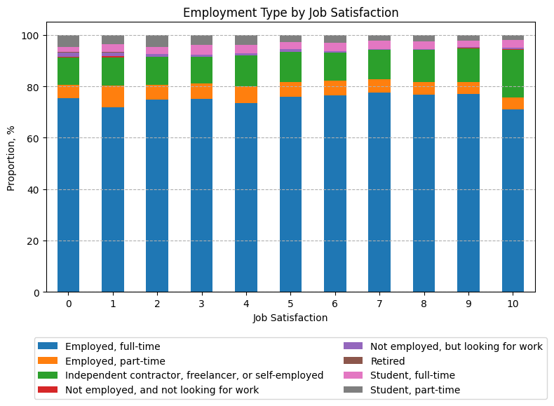
2. Stacked Chart of Employment Type by Job Satisfaction
Analyze the distribution of employment types within each job satisfaction level using a stacked chart. This will provide insights into how employment types are distributed across various satisfaction ratings.
##Write your code here
df_se = df[df.Employment != "I prefer not to say"][["JobSat", "Employment"]].dropna()
df_se.JobSat = df_se.JobSat.astype(int)
# Split, explode, clean, aggregate
df_exp = (df_se.assign(Empl=df_se["Employment"].str.split(";"))
    .explode("Empl").dropna(subset=["Empl"]))
df_exp["Empl"] = df_exp["Empl"].str.strip()
df_exp = (df_exp.groupby(["JobSat", "Empl"], as_index=False).size()
          .rename(columns={"size": "Respondents"})).sort_values(by=["JobSat", "Respondents"], ascending=False)
df_exp["Proportion"] = (100 * df_exp["Respondents"] /df_exp.groupby("JobSat")["Respondents"].transform("sum"))
df_exp = df_exp.pivot(index="JobSat", columns="Empl", values="Proportion")
#print(df_exp)
ax = df_exp.plot(kind="bar", figsize=(9, 5), stacked=True)

ax.set(xlabel="Job Satisfaction", ylabel="Proportion, %")
plt.title("Employment Type by Job Satisfaction")
plt.xticks(rotation=0)
plt.grid(True, axis="y", linestyle="dashed")
ax.legend(loc='upper center', bbox_to_anchor=(0.5, -0.15), ncol=2)

plt.show()
Task 4: Exploring Technology Preferences Using Stacked Charts
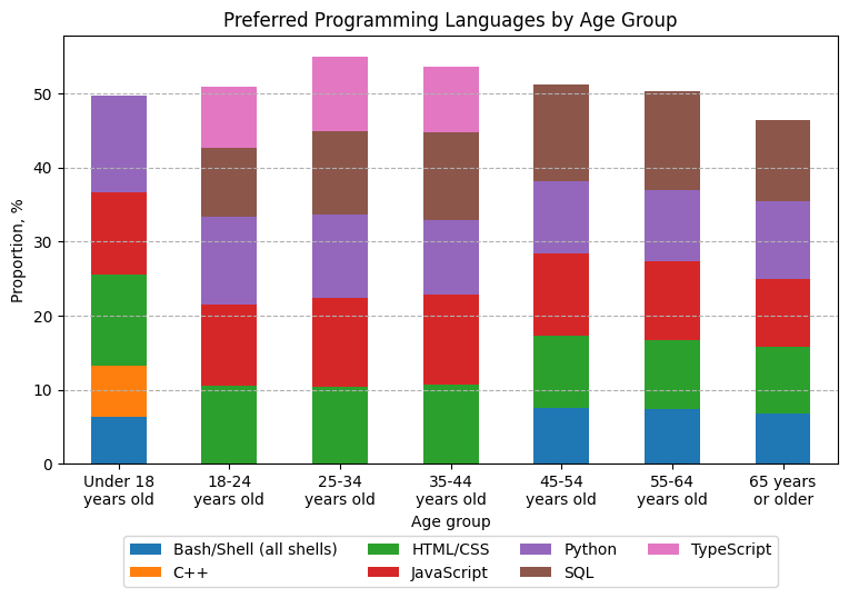
1. Stacked Chart for Preferred Programming Languages by Age Group
Analyze how programming language preferences (LanguageAdmired) vary across age groups.
##Write your code here
df_la = df[df.Age != "Prefer not to say"][["Age", "LanguageAdmired"]].dropna()
# Split, explode, clean, aggregate
df_exp = (df_la.assign(Lang=df_la["LanguageAdmired"].str.split(";"))
    .explode("Lang").dropna(subset=["Lang"]))
df_exp["Lang"] = df_exp["Lang"].str.strip()
df_exp = (df_exp.groupby(["Age", "Lang"], as_index=False).size()
          .rename(columns={"size": "Respondents"})).sort_values(by=["Age", "Respondents"], ascending=False)
df_exp["Proportion"] = (100 * df_exp["Respondents"] /df_exp.groupby("Age")["Respondents"].transform("sum"))
df_expc = pd.concat([df_exp[df_exp.Age == a].head() for a in df_exp.Age.unique()], ignore_index=True)
df_expc = df_expc.pivot(index="Age", columns="Lang", values="Proportion").reset_index()
order = [6, 0, 1, 2, 3, 4, 5]
df_expc = df_expc.reindex(order)
#print(df_expc)
ax = df_expc.plot(kind="bar", x="Age", figsize=(9, 5), stacked=True)

xlabels = [textwrap.fill(label.get_text(), width=10) for label in ax.get_xticklabels()]
ax.set(xlabel="Age group", ylabel="Proportion, %")
ax.set_xticklabels(xlabels)
plt.title("Preferred Programming Languages by Age Group")
plt.xticks(rotation=0)
plt.grid(True, axis="y", linestyle="dashed")
ax.legend(loc='upper center', bbox_to_anchor=(0.5, -0.15), ncol=4)

plt.show()
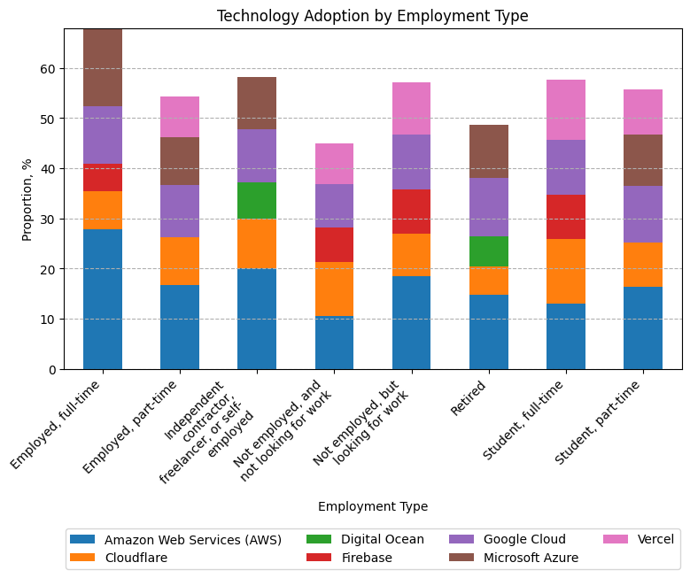
2. Stacked Chart for Technology Adoption by Employment Type
Explore how admired platforms (PlatformAdmired) differ across employment types (e.g., full-time, freelance)
##Write your code here
df_ple = df[df.Employment != "I prefer not to say"][["PlatformAdmired", "Employment"]].dropna()
# Split, explode, clean, aggregate
df_exp = (df_ple.assign(Empl=df_ple["Employment"].str.split(";"))
    .explode("Empl").dropna(subset=["Empl"]))
df_exp["Empl"] = df_exp["Empl"].str.strip()
df_exp = (df_exp.assign(Pla=df_exp["PlatformAdmired"].str.split(";"))
    .explode("Pla").dropna(subset=["Pla"]))
df_exp["Pla"] = df_exp["Pla"].str.strip()
df_exp = (df_exp.groupby(["Empl", "Pla"], as_index=False).size()
          .rename(columns={"size": "Respondents"})).sort_values(by=["Empl", "Respondents"], ascending=False)
df_exp["Proportion"] = (100 * df_exp["Respondents"] /df_exp.groupby("Empl")["Respondents"].transform("sum"))
df_expc = pd.concat([df_exp[df_exp.Empl == a].head() for a in df_exp.Empl.unique()], ignore_index=True)
df_expc = df_expc.pivot(index="Empl", columns="Pla", values="Proportion")
#print(df_expc[df_expc.Empl == "Student, part-time"])
ax = df_expc.plot(kind="bar", figsize=(9, 5), stacked=True)

ax.set(xlabel="Employment Type", ylabel="Proportion, %")
xlabels = [textwrap.fill(label.get_text(), width=20) for label in ax.get_xticklabels()]
ax.set_xticklabels(xlabels)
plt.title("Technology Adoption by Employment Type")
plt.xticks(rotation=0)
plt.grid(True, axis="y", linestyle="dashed")
plt.xticks(rotation=45, ha="right")
ax.legend(loc='upper center', bbox_to_anchor=(0.5, -0.45), ncol=4)

plt.show()
Final Step: Review
In this lab, you focused on using stacked charts to understand the composition and comparison within the dataset. Stacked charts provided insights into job satisfaction, compensation, and preferred databases across age groups and employment types.
Summary
After completing this lab, you will be able to:
-
Use stacked charts to analyze the composition of data across categories, such as job satisfaction and compensation by age group.
-
Compare data across different dimensions using stacked charts, enhancing your ability to communicate complex relationships in the data.
-
Visualize distributions across multiple categories, such as employment type by satisfaction, to gain a deeper understanding of patterns within the dataset.
Author:
Ayushi Jain
Other Contributors:
- Rav Ahuja
- Lakshmi Holla
- Malika