
Line Charts
Estimated time needed: 30 minutes
In this lab, you will focus on using line charts to analyze trends over time and across different categories in a dataset.
Objectives
In this lab you will perform the following:
-
Track trends in compensation across age groups and specific age ranges.
-
Analyze job satisfaction trends based on experience level.
-
Explore and interpret line charts to identify patterns and trends.
Setup: Working with the Database
Install the needed libraries
!pip install pandas
Requirement already satisfied: pandas in /opt/conda/lib/python3.12/site-packages (3.0.0)
Requirement already satisfied: numpy>=1.26.0 in /opt/conda/lib/python3.12/site-packages (from pandas) (2.4.2)
Requirement already satisfied: python-dateutil>=2.8.2 in /opt/conda/lib/python3.12/site-packages (from pandas) (2.9.0.post0)
Requirement already satisfied: six>=1.5 in /opt/conda/lib/python3.12/site-packages (from python-dateutil>=2.8.2->pandas) (1.17.0)
!pip install matplotlib
!pip install seaborn
Requirement already satisfied: matplotlib in /opt/conda/lib/python3.12/site-packages (3.10.8)
Requirement already satisfied: contourpy>=1.0.1 in /opt/conda/lib/python3.12/site-packages (from matplotlib) (1.3.3)
Requirement already satisfied: cycler>=0.10 in /opt/conda/lib/python3.12/site-packages (from matplotlib) (0.12.1)
Requirement already satisfied: fonttools>=4.22.0 in /opt/conda/lib/python3.12/site-packages (from matplotlib) (4.61.1)
Requirement already satisfied: kiwisolver>=1.3.1 in /opt/conda/lib/python3.12/site-packages (from matplotlib) (1.4.9)
Requirement already satisfied: numpy>=1.23 in /opt/conda/lib/python3.12/site-packages (from matplotlib) (2.4.2)
Requirement already satisfied: packaging>=20.0 in /opt/conda/lib/python3.12/site-packages (from matplotlib) (24.2)
Requirement already satisfied: pillow>=8 in /opt/conda/lib/python3.12/site-packages (from matplotlib) (12.1.1)
Requirement already satisfied: pyparsing>=3 in /opt/conda/lib/python3.12/site-packages (from matplotlib) (3.3.2)
Requirement already satisfied: python-dateutil>=2.7 in /opt/conda/lib/python3.12/site-packages (from matplotlib) (2.9.0.post0)
Requirement already satisfied: six>=1.5 in /opt/conda/lib/python3.12/site-packages (from python-dateutil>=2.7->matplotlib) (1.17.0)
Requirement already satisfied: seaborn in /opt/conda/lib/python3.12/site-packages (0.13.2)
Requirement already satisfied: numpy!=1.24.0,>=1.20 in /opt/conda/lib/python3.12/site-packages (from seaborn) (2.4.2)
Requirement already satisfied: pandas>=1.2 in /opt/conda/lib/python3.12/site-packages (from seaborn) (3.0.0)
Requirement already satisfied: matplotlib!=3.6.1,>=3.4 in /opt/conda/lib/python3.12/site-packages (from seaborn) (3.10.8)
Requirement already satisfied: contourpy>=1.0.1 in /opt/conda/lib/python3.12/site-packages (from matplotlib!=3.6.1,>=3.4->seaborn) (1.3.3)
Requirement already satisfied: cycler>=0.10 in /opt/conda/lib/python3.12/site-packages (from matplotlib!=3.6.1,>=3.4->seaborn) (0.12.1)
Requirement already satisfied: fonttools>=4.22.0 in /opt/conda/lib/python3.12/site-packages (from matplotlib!=3.6.1,>=3.4->seaborn) (4.61.1)
Requirement already satisfied: kiwisolver>=1.3.1 in /opt/conda/lib/python3.12/site-packages (from matplotlib!=3.6.1,>=3.4->seaborn) (1.4.9)
Requirement already satisfied: packaging>=20.0 in /opt/conda/lib/python3.12/site-packages (from matplotlib!=3.6.1,>=3.4->seaborn) (24.2)
Requirement already satisfied: pillow>=8 in /opt/conda/lib/python3.12/site-packages (from matplotlib!=3.6.1,>=3.4->seaborn) (12.1.1)
Requirement already satisfied: pyparsing>=3 in /opt/conda/lib/python3.12/site-packages (from matplotlib!=3.6.1,>=3.4->seaborn) (3.3.2)
Requirement already satisfied: python-dateutil>=2.7 in /opt/conda/lib/python3.12/site-packages (from matplotlib!=3.6.1,>=3.4->seaborn) (2.9.0.post0)
Requirement already satisfied: six>=1.5 in /opt/conda/lib/python3.12/site-packages (from python-dateutil>=2.7->matplotlib!=3.6.1,>=3.4->seaborn) (1.17.0)
Download and connect to the database file containing survey data.
To start, download and load the dataset into a pandas DataFrame.
Step 1: Download the dataset
!wget -O survey-data.csv https://cf-courses-data.s3.us.cloud-object-storage.appdomain.cloud/n01PQ9pSmiRX6520flujwQ/survey-data.csv
--2026-02-12 08:01:00--  https://cf-courses-data.s3.us.cloud-object-storage.appdomain.cloud/n01PQ9pSmiRX6520flujwQ/survey-data.csv
Resolving cf-courses-data.s3.us.cloud-object-storage.appdomain.cloud (cf-courses-data.s3.us.cloud-object-storage.appdomain.cloud)... 169.63.118.104
Connecting to cf-courses-data.s3.us.cloud-object-storage.appdomain.cloud (cf-courses-data.s3.us.cloud-object-storage.appdomain.cloud)|169.63.118.104|:443... connected.
200 OKequest sent, awaiting response...
Length: 159525875 (152M) [text/csv]
Saving to: ‘survey-data.csv’

survey-data.csv     100%[===================>] 152.13M  30.8MB/s    in 5.1s

2026-02-12 08:01:06 (30.1 MB/s) - ‘survey-data.csv’ saved [159525875/159525875]
Step 2: Import necessary libraries and load the dataset
import pandas as pd
import matplotlib.pyplot as plt
import seaborn as sns
import textwrap
import numpy as np
Load the data
df = pd.read_csv("survey-data.csv")
Display the first few rows to understand the structure of the data
print(df.head())
print('Initial dataframe:', df.shape)
   ResponseId                      MainBranch                 Age  \
0           1  I am a developer by profession  Under 18 years old
1           2  I am a developer by profession     35-44 years old
2           3  I am a developer by profession     45-54 years old
3           4           I am learning to code     18-24 years old
4           5  I am a developer by profession     18-24 years old

            Employment RemoteWork   Check  \
0  Employed, full-time     Remote  Apples
1  Employed, full-time     Remote  Apples
2  Employed, full-time     Remote  Apples
3   Student, full-time        NaN  Apples
4   Student, full-time        NaN  Apples

                                    CodingActivities  \
0                                              Hobby
1  Hobby;Contribute to open-source projects;Other...
2  Hobby;Contribute to open-source projects;Other...
3                                                NaN
4                                                NaN

                                             EdLevel  \
0                          Primary/elementary school
1       Bachelor’s degree (B.A., B.S., B.Eng., etc.)
2    Master’s degree (M.A., M.S., M.Eng., MBA, etc.)
3  Some college/university study without earning ...
4  Secondary school (e.g. American high school, G...

                                           LearnCode  \
0                             Books / Physical media
1  Books / Physical media;Colleague;On the job tr...
2  Books / Physical media;Colleague;On the job tr...
3  Other online resources (e.g., videos, blogs, f...
4  Other online resources (e.g., videos, blogs, f...

                                     LearnCodeOnline  ... JobSatPoints_6  \
0                                                NaN  ...            NaN
1  Technical documentation;Blogs;Books;Written Tu...  ...            0.0
2  Technical documentation;Blogs;Books;Written Tu...  ...            NaN
3  Stack Overflow;How-to videos;Interactive tutorial  ...            NaN
4  Technical documentation;Blogs;Written Tutorial...  ...            NaN

  JobSatPoints_7 JobSatPoints_8 JobSatPoints_9 JobSatPoints_10  \
0            NaN            NaN            NaN             NaN
1            0.0            0.0            0.0             0.0
2            NaN            NaN            NaN             NaN
3            NaN            NaN            NaN             NaN
4            NaN            NaN            NaN             NaN

  JobSatPoints_11           SurveyLength SurveyEase ConvertedCompYearly JobSat
0             NaN                    NaN        NaN                 NaN    NaN
1             0.0                    NaN        NaN                 NaN    NaN
2             NaN  Appropriate in length       Easy                 NaN    NaN
3             NaN               Too long       Easy                 NaN    NaN
4             NaN              Too short       Easy                 NaN    NaN

[5 rows x 114 columns]
Initial dataframe: (65437, 114)
Task 1: Trends in Compensation Over Age Groups
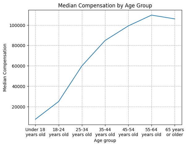
1. Line Chart of Median ConvertedCompYearly by Age Group
-
Track how the median yearly compensation (ConvertedCompYearly) changes across different age groups.
-
Use a line chart to visualize these trends.
## Write your code here
ca1 = df[["ConvertedCompYearly", "Age"]].dropna().groupby("Age", as_index=False).median()

order = [7, 0, 1, 2, 3, 4, 5]
ca1 = ca1.reindex(order)

plt.figsize=(10, 6)
ax = sns.lineplot(data=ca1, x="Age", y="ConvertedCompYearly")
xlabels = [textwrap.fill(label.get_text(), width=10) for label in ax.get_xticklabels()]
ax.set_xticklabels(xlabels)
plt.title('Median Compensation by Age Group')
plt.xlabel('Age group')
plt.grid(True, linestyle='dashed')
plt.xticks(rotation=0)
plt.ylabel('Median Compensation')
plt.show()
/tmp/ipykernel_300/3280243353.py:10: UserWarning: set_ticklabels() should only be used with a fixed number of ticks, i.e. after set_ticks() or using a FixedLocator.
  ax.set_xticklabels(xlabels)
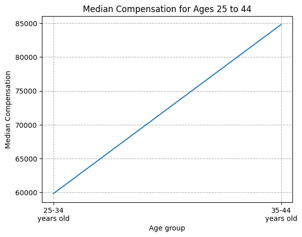
2. Line Chart of Median ConvertedCompYearly for Ages 25 to 45
For a closer look, plot a line chart focusing on the median compensation for respondents between ages 25 and 45.
## Write your code here
ca2 = (df[df.Age.isin(["25-34 years old", "35-44 years old"])][["ConvertedCompYearly", "Age"]]
       .dropna().groupby("Age", as_index=False).median())

plt.figsize=(10, 6)
ax = sns.lineplot(data=ca2, x="Age", y="ConvertedCompYearly")
xlabels = [textwrap.fill(label.get_text(), width=10) for label in ax.get_xticklabels()]
ax.set_xticklabels(xlabels)
plt.title('Median Compensation for Ages 25 to 44')
plt.xlabel('Age group')
plt.grid(True, linestyle='dashed')
plt.xticks(rotation=0)
plt.ylabel('Median Compensation')
plt.show()
/tmp/ipykernel_300/2617691546.py:8: UserWarning: set_ticklabels() should only be used with a fixed number of ticks, i.e. after set_ticks() or using a FixedLocator.
  ax.set_xticklabels(xlabels)
Task 2: Trends in Job Satisfaction by Experience Level
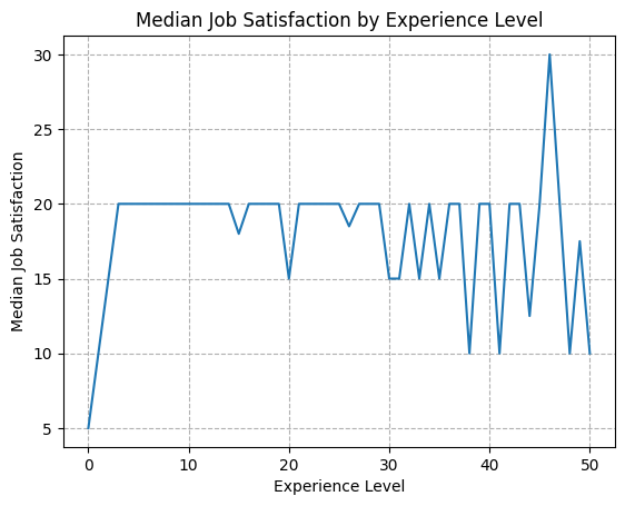
1. Line Chart of Job Satisfaction (JobSatPoints_6) by Experience Level
-
Use a column that approximates experience level to analyze how job satisfaction changes with experience.
-
If needed, substitute an available experience-related column for
Experience.
for c in df.columns:
    if "exp" in c.lower():
        print(c)
WorkExp
df.JobSatPoints_6.describe()
count    29450.000000
mean        24.343232
std         27.089360
min          0.000000
25%          0.000000
50%         20.000000
75%         30.000000
max        100.000000
Name: JobSatPoints_6, dtype: float64
## Write your code here
se = df[["JobSatPoints_6", "WorkExp"]].dropna().groupby("WorkExp", as_index=False).median()

plt.figsize=(10, 6)
ax = sns.lineplot(data=se, x="WorkExp", y="JobSatPoints_6")
xlabels = [textwrap.fill(label.get_text(), width=10) for label in ax.get_xticklabels()]
ax.set_xticklabels(xlabels)
plt.title("Median Job Satisfaction by Experience Level")
plt.xlabel("Experience Level")
plt.grid(True, linestyle="dashed")
plt.xticks(rotation=0)
plt.ylabel('Median Job Satisfaction')
plt.show()
/tmp/ipykernel_300/3348157748.py:7: UserWarning: set_ticklabels() should only be used with a fixed number of ticks, i.e. after set_ticks() or using a FixedLocator.
  ax.set_xticklabels(xlabels)
Task 3: Trends in Job Satisfaction and Compensation by Experience
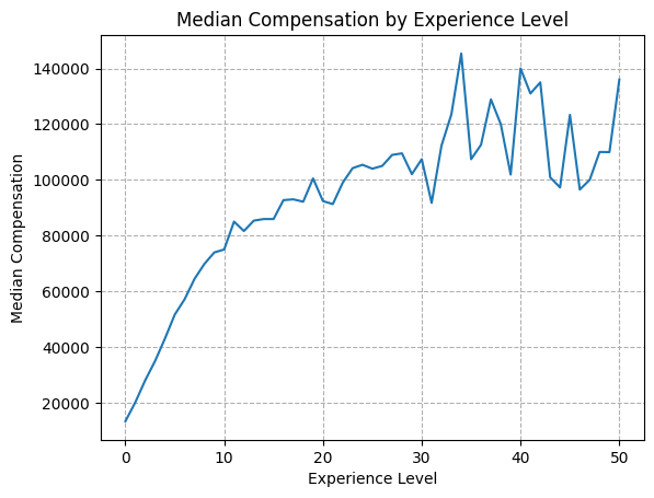
1.Line Chart of Median ConvertedCompYearly Over Experience Level
-
This line chart will track how median compensation (
ConvertedCompYearly) changes with increasing experience. -
Use a column such as
WorkExpor another relevant experience-related column.
## Write your code here
ce = df[["ConvertedCompYearly", "WorkExp"]].dropna().groupby("WorkExp", as_index=False).median()

plt.figsize=(10, 6)
ax = sns.lineplot(data=ce, x="WorkExp", y="ConvertedCompYearly")
xlabels = [textwrap.fill(label.get_text(), width=10) for label in ax.get_xticklabels()]
ax.set_xticklabels(xlabels)
plt.title("Median Compensation by Experience Level")
plt.xlabel("Experience Level")
plt.grid(True, linestyle="dashed")
plt.xticks(rotation=0)
plt.ylabel('Median Compensation')
plt.show()
/tmp/ipykernel_300/3578051830.py:7: UserWarning: set_ticklabels() should only be used with a fixed number of ticks, i.e. after set_ticks() or using a FixedLocator.
  ax.set_xticklabels(xlabels)
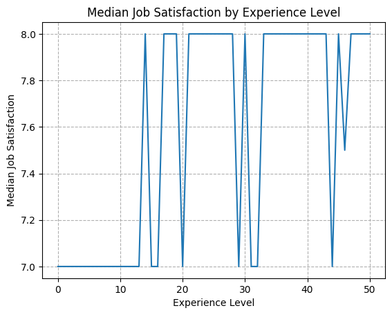
2.Line Chart of Job Satisfaction (JobSatPoints_6) Across Experience Levels
-
Create a line chart to explore trends in job satisfaction (
JobSatPoints_6) based on experience level. -
This chart will provide insight into how satisfaction correlates with experience over time
## Write your code here
se = df[["JobSat", "WorkExp"]].dropna().groupby("WorkExp", as_index=False).median()

plt.figsize=(10, 6)
ax = sns.lineplot(data=se, x="WorkExp", y="JobSat")
xlabels = [textwrap.fill(label.get_text(), width=10) for label in ax.get_xticklabels()]
ax.set_xticklabels(xlabels)
plt.title("Median Job Satisfaction by Experience Level")
plt.xlabel("Experience Level")
plt.grid(True, linestyle="dashed")
plt.xticks(rotation=0)
plt.ylabel('Median Job Satisfaction')
plt.show()
/tmp/ipykernel_300/462392273.py:7: UserWarning: set_ticklabels() should only be used with a fixed number of ticks, i.e. after set_ticks() or using a FixedLocator.
  ax.set_xticklabels(xlabels)
Final Step: Review
In this lab, you focused on analyzing trends in compensation and job satisfaction, specifically exploring how these metrics change with age and experience levels using line charts.
Summary
In this lab, you explored essential data visualization techniques with a focus on analyzing trends using line charts. You learned to:
-
Visualize the distribution of compensation across age groups to understand salary trends.
-
Track changes in median compensation over various experience levels, identifying how earnings progress with experience.
-
Examine trends in job satisfaction by experience, revealing how satisfaction varies throughout a developer's career.
These analyses allow for a deeper understanding of how factors like age and experience influence job satisfaction and compensation. By using line charts, you gained insights into continuous data patterns, which are invaluable for interpreting professional trends in the developer community.
Authors:
Ayushi Jain
Other Contributors:
- Rav Ahuja
- Lakshmi Holla
- Malika